    I made a thing.

            http://unicorn.wmflabs.org/navmod/

    Here’s the documentation:
https://www.mediawiki.org/wiki/Vector_Navigation_Modification
    The plan is to build it as a Beta Labs feature.

    Discuss.
--- Brandon Harris, Senior Designer, Wikimedia Foundation
Support Free Knowledge: http://wikimediafoundation.org/wiki/Donate
YAYYYY!!!!!!!!
On Mon, Nov 25, 2013 at 3:42 PM, Brandon Harris bharris@wikimedia.orgwrote:
    I made a thing.

            http://unicorn.wmflabs.org/navmod/

    Here’s the documentation:
https://www.mediawiki.org/wiki/Vector_Navigation_Modification
    The plan is to build it as a Beta Labs feature.

    Discuss.
Brandon Harris, Senior Designer, Wikimedia Foundation
Support Free Knowledge: http://wikimediafoundation.org/wiki/Donate
Design mailing list Design@lists.wikimedia.org https://lists.wikimedia.org/mailman/listinfo/design
We should quickly refine the visual design and get this into labs! This is so cool Brandon! Get it in tomorrow!!!
On Mon, Nov 25, 2013 at 3:48 PM, Kaity Hammerstein < khammerstein@wikimedia.org> wrote:
YAYYYY!!!!!!!!
On Mon, Nov 25, 2013 at 3:42 PM, Brandon Harris bharris@wikimedia.orgwrote:
    I made a thing.

            http://unicorn.wmflabs.org/navmod/

    Here’s the documentation:
https://www.mediawiki.org/wiki/Vector_Navigation_Modification
    The plan is to build it as a Beta Labs feature.

    Discuss.
Brandon Harris, Senior Designer, Wikimedia Foundation
Support Free Knowledge: http://wikimediafoundation.org/wiki/Donate
Design mailing list Design@lists.wikimedia.org https://lists.wikimedia.org/mailman/listinfo/design
Design mailing list Design@lists.wikimedia.org https://lists.wikimedia.org/mailman/listinfo/design
Brandon, this is great, I figured out what was bothering me about the parallax issue with the search bar fixing then the logo fixing. Can you not have it draw the left hand shadow? just a straight down shadow? This will make it less obvious that it it isn't a fixed bar all the way across. Small change.
Great work, can't wait to get this into Beta Features
*Jared Zimmerman * \ Director of User Experience \ Wikimedia Foundation
M : +1 415 609 4043 | : @JaredZimmermanhttps://twitter.com/JaredZimmerman
On Mon, Nov 25, 2013 at 3:48 PM, Kaity Hammerstein < khammerstein@wikimedia.org> wrote:
YAYYYY!!!!!!!!
On Mon, Nov 25, 2013 at 3:42 PM, Brandon Harris bharris@wikimedia.orgwrote:
    I made a thing.

            http://unicorn.wmflabs.org/navmod/

    Here’s the documentation:
https://www.mediawiki.org/wiki/Vector_Navigation_Modification
    The plan is to build it as a Beta Labs feature.

    Discuss.
Brandon Harris, Senior Designer, Wikimedia Foundation
Support Free Knowledge: http://wikimediafoundation.org/wiki/Donate
Design mailing list Design@lists.wikimedia.org https://lists.wikimedia.org/mailman/listinfo/design
Design mailing list Design@lists.wikimedia.org https://lists.wikimedia.org/mailman/listinfo/design
I also think we need to think about the rest state. The drop shadow works on scroll, but its heavy if you pause.
Brandon, is someone helping you visual design wise?
On Mon, Nov 25, 2013 at 3:51 PM, Jared Zimmerman < jared.zimmerman@wikimedia.org> wrote:
Brandon, this is great, I figured out what was bothering me about the parallax issue with the search bar fixing then the logo fixing. Can you not have it draw the left hand shadow? just a straight down shadow? This will make it less obvious that it it isn't a fixed bar all the way across. Small change.
Great work, can't wait to get this into Beta Features
*Jared Zimmerman * \ Director of User Experience \ Wikimedia Foundation M : +1 415 609 4043 | : @JaredZimmermanhttps://twitter.com/JaredZimmerman
On Mon, Nov 25, 2013 at 3:48 PM, Kaity Hammerstein < khammerstein@wikimedia.org> wrote:
YAYYYY!!!!!!!!
On Mon, Nov 25, 2013 at 3:42 PM, Brandon Harris bharris@wikimedia.orgwrote:
    I made a thing.

            http://unicorn.wmflabs.org/navmod/

    Here’s the documentation:
https://www.mediawiki.org/wiki/Vector_Navigation_Modification
    The plan is to build it as a Beta Labs feature.

    Discuss.
Brandon Harris, Senior Designer, Wikimedia Foundation
Support Free Knowledge: http://wikimediafoundation.org/wiki/Donate
Design mailing list Design@lists.wikimedia.org https://lists.wikimedia.org/mailman/listinfo/design
Design mailing list Design@lists.wikimedia.org https://lists.wikimedia.org/mailman/listinfo/design
Design mailing list Design@lists.wikimedia.org https://lists.wikimedia.org/mailman/listinfo/design
Here is the Svg icon that you guys can use for Article History
On Mon, Nov 25, 2013 at 3:55 PM, Vibha Bamba vbamba@wikimedia.org wrote:
I also think we need to think about the rest state. The drop shadow works on scroll, but its heavy if you pause.
Brandon, is someone helping you visual design wise?
On Mon, Nov 25, 2013 at 3:51 PM, Jared Zimmerman < jared.zimmerman@wikimedia.org> wrote:
Brandon, this is great, I figured out what was bothering me about the parallax issue with the search bar fixing then the logo fixing. Can you not have it draw the left hand shadow? just a straight down shadow? This will make it less obvious that it it isn't a fixed bar all the way across. Small change.
Great work, can't wait to get this into Beta Features
*Jared Zimmerman * \ Director of User Experience \ Wikimedia Foundation M : +1 415 609 4043 | : @JaredZimmermanhttps://twitter.com/JaredZimmerman
On Mon, Nov 25, 2013 at 3:48 PM, Kaity Hammerstein < khammerstein@wikimedia.org> wrote:
YAYYYY!!!!!!!!
On Mon, Nov 25, 2013 at 3:42 PM, Brandon Harris bharris@wikimedia.orgwrote:
    I made a thing.

            http://unicorn.wmflabs.org/navmod/

    Here’s the documentation:
https://www.mediawiki.org/wiki/Vector_Navigation_Modification
    The plan is to build it as a Beta Labs feature.

    Discuss.
Brandon Harris, Senior Designer, Wikimedia Foundation
Support Free Knowledge: http://wikimediafoundation.org/wiki/Donate
Design mailing list Design@lists.wikimedia.org https://lists.wikimedia.org/mailman/listinfo/design
Design mailing list Design@lists.wikimedia.org https://lists.wikimedia.org/mailman/listinfo/design
Design mailing list Design@lists.wikimedia.org https://lists.wikimedia.org/mailman/listinfo/design
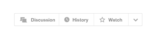
Maybe the article actions menu could include icons, and then remove the word "more" and just have a dropdown arrow, like this: [image: Inline image 1]
On Mon, Nov 25, 2013 at 4:04 PM, Vibha Bamba vbamba@wikimedia.org wrote:
Here is the Svg icon that you guys can use for Article History
On Mon, Nov 25, 2013 at 3:55 PM, Vibha Bamba vbamba@wikimedia.org wrote:
I also think we need to think about the rest state. The drop shadow works on scroll, but its heavy if you pause.
Brandon, is someone helping you visual design wise?
On Mon, Nov 25, 2013 at 3:51 PM, Jared Zimmerman < jared.zimmerman@wikimedia.org> wrote:
Brandon, this is great, I figured out what was bothering me about the parallax issue with the search bar fixing then the logo fixing. Can you not have it draw the left hand shadow? just a straight down shadow? This will make it less obvious that it it isn't a fixed bar all the way across. Small change.
Great work, can't wait to get this into Beta Features
*Jared Zimmerman * \ Director of User Experience \ Wikimedia Foundation M : +1 415 609 4043 | : @JaredZimmermanhttps://twitter.com/JaredZimmerman
On Mon, Nov 25, 2013 at 3:48 PM, Kaity Hammerstein < khammerstein@wikimedia.org> wrote:
YAYYYY!!!!!!!!
On Mon, Nov 25, 2013 at 3:42 PM, Brandon Harris bharris@wikimedia.orgwrote:
I made a thing. http://unicorn.wmflabs.org/navmod/ Here’s the documentation:https://www.mediawiki.org/wiki/Vector_Navigation_Modification
The plan is to build it as a Beta Labs feature. Discuss.
Brandon Harris, Senior Designer, Wikimedia Foundation
Support Free Knowledge: http://wikimediafoundation.org/wiki/Donate
Design mailing list Design@lists.wikimedia.org https://lists.wikimedia.org/mailman/listinfo/design
Design mailing list Design@lists.wikimedia.org https://lists.wikimedia.org/mailman/listinfo/design
Design mailing list Design@lists.wikimedia.org https://lists.wikimedia.org/mailman/listinfo/design
Design mailing list Design@lists.wikimedia.org https://lists.wikimedia.org/mailman/listinfo/design
In love with this idea.
On Nov 25, 2013, at 4:22 PM, Kaity Hammerstein khammerstein@wikimedia.org wrote:
Maybe the article actions menu could include icons, and then remove the word "more" and just have a dropdown arrow, like this: <menu-with-icons-01.png>
On Mon, Nov 25, 2013 at 4:04 PM, Vibha Bamba vbamba@wikimedia.org wrote: Here is the Svg icon that you guys can use for Article History
On Mon, Nov 25, 2013 at 3:55 PM, Vibha Bamba vbamba@wikimedia.org wrote: I also think we need to think about the rest state. The drop shadow works on scroll, but its heavy if you pause.
Brandon, is someone helping you visual design wise?
On Mon, Nov 25, 2013 at 3:51 PM, Jared Zimmerman jared.zimmerman@wikimedia.org wrote: Brandon, this is great, I figured out what was bothering me about the parallax issue with the search bar fixing then the logo fixing. Can you not have it draw the left hand shadow? just a straight down shadow? This will make it less obvious that it it isn't a fixed bar all the way across. Small change.
Great work, can't wait to get this into Beta Features
Jared Zimmerman \ Director of User Experience \ Wikimedia Foundation M : +1 415 609 4043 | : @JaredZimmerman
On Mon, Nov 25, 2013 at 3:48 PM, Kaity Hammerstein khammerstein@wikimedia.org wrote: YAYYYY!!!!!!!!
On Mon, Nov 25, 2013 at 3:42 PM, Brandon Harris bharris@wikimedia.org wrote:
    I made a thing.

            http://unicorn.wmflabs.org/navmod/

    Here’s the documentation:

            https://www.mediawiki.org/wiki/Vector_Navigation_Modification

    The plan is to build it as a Beta Labs feature.

    Discuss.
Brandon Harris, Senior Designer, Wikimedia Foundation
Support Free Knowledge: http://wikimediafoundation.org/wiki/Donate
Design mailing list Design@lists.wikimedia.org https://lists.wikimedia.org/mailman/listinfo/design
Design mailing list Design@lists.wikimedia.org https://lists.wikimedia.org/mailman/listinfo/design
Design mailing list Design@lists.wikimedia.org https://lists.wikimedia.org/mailman/listinfo/design
Design mailing list Design@lists.wikimedia.org https://lists.wikimedia.org/mailman/listinfo/design
--- Brandon Harris, Senior Designer, Wikimedia Foundation
Support Free Knowledge: http://wikimediafoundation.org/wiki/Donate
Ohhh ... this will be fun to play with.
On Mon, Nov 25, 2013 at 3:42 PM, Brandon Harris bharris@wikimedia.org wrote:
    I made a thing.

            http://unicorn.wmflabs.org/navmod/

    Here’s the documentation:

            https://www.mediawiki.org/wiki/Vector_Navigation_Modification

    The plan is to build it as a Beta Labs feature.

    Discuss.
Brandon Harris, Senior Designer, Wikimedia Foundation
Support Free Knowledge: http://wikimediafoundation.org/wiki/Donate
Design mailing list Design@lists.wikimedia.org https://lists.wikimedia.org/mailman/listinfo/design
Sweet. I'd suggest adding it to the VectorBeta extension. I can happily help you get this up and running and help push code review along if you whack an initial version in... :-)
https://gerrit.wikimedia.org/r/#/admin/projects/mediawiki/extensions/VectorB...
On Mon, Nov 25, 2013 at 4:50 PM, Tomasz Finc tfinc@wikimedia.org wrote:
Ohhh ... this will be fun to play with.
On Mon, Nov 25, 2013 at 3:42 PM, Brandon Harris bharris@wikimedia.org wrote:
    I made a thing.

            http://unicorn.wmflabs.org/navmod/

    Here’s the documentation:
https://www.mediawiki.org/wiki/Vector_Navigation_Modification
    The plan is to build it as a Beta Labs feature.

    Discuss.
Brandon Harris, Senior Designer, Wikimedia Foundation
Support Free Knowledge: http://wikimediafoundation.org/wiki/Donate
Design mailing list Design@lists.wikimedia.org https://lists.wikimedia.org/mailman/listinfo/design
Design mailing list Design@lists.wikimedia.org https://lists.wikimedia.org/mailman/listinfo/design
Brandon Harris wrote:
I made a thing.
This is neat. Thanks for putting this together. :-)
You and I have previously discussed the idea that giving in and making an editor skin and a reader skin might be unavoidable. This would likely be a strong step in that direction.
Initial thoughts about the mock itself:
* the blue "edit" button flashing at a user during scroll won't be acceptable ** the section highlighting is neat, but may have difficulty integrating with VisualEditor ** moving the section links back over is probably more "cognitive load" than users are willing to deal with * many editors will hate requiring two clicks to access tools in both drop-down menus (watchlist, links here, page info, etc.) * "discussion, history, more" feels very in the way when inserted between the page title and the page content
Broadly, I'm not sure the whole BetaFeatures approach makes a lot of sense in cases like this. It seems like it would be difficult to get any meaningful data when so many variables change simultaneously.
MZMcBride
On Mon, Nov 25, 2013 at 11:09 PM, MZMcBride z@mzmcbride.com wrote:
Broadly, I'm not sure the whole BetaFeatures approach makes a lot of sense in cases like this. It seems like it would be difficult to get any meaningful data when so many variables change simultaneously.
In this case, I think Beta Features is a good choice because I don't think we would be looking to primarily gather usage statistics, such as to support one particular aspect or to argue for a switch over to this navigation soon. With Beta Features, we'd just be looking to get qualitative feedback from people, to see how it works or doesn't for everyday use.
Some responses
*the blue "edit" button flashing at a user during scroll won't be acceptable* Jared - I think the concept of having a two stage normal → hover → highlight region, where currently normal is hidden, I think we could transition to a "quieter" normal state that isn't hidden, more to test.
*the section highlighting is neat, but may have difficulty integrating with VisualEditor* Jared - Doubt it will be difficult since it has nothing to do with VE (its before VE is invoked) but VE section editing is in the works so we're aligned on that.
*moving the section links back over is probably more "cognitive load" than users are willing to deal with* Jared - I don't know what this means, do you mean the edit links on the right vs to the right of the section headers? I do think having them in a fixed location is a good idea but right aligned vs left will be something to test and get feedback on
*many editors will hate requiring two clicks to access tools in both drop-down menus* Jared - for feedback on the personal bar dropdown put that here please https://www.mediawiki.org/wiki/Compact_Personal_Bar for the article actions, the menu could be either on hover or on click, some of the actions might be reasonably moved out of the drop down but likely there will always be a junk drawer.
////
I played around with alignment, and styling, notes below.
[image: Inline image 1]
1. I don't know that we even need a drop shadow, just a simple line 2. Once scrolled we could transition the search placeholder text to be the article title:section, and show "Search Wikipedia" or something like that on hover 3. Once scrolled I'd like to see us try to get talk & history in the fixed header maybe slide in between the logo and the search icon on scroll. 4. Super excited about this.
*Jared Zimmerman * \ Director of User Experience \ Wikimedia Foundation
M : +1 415 609 4043 | : @JaredZimmermanhttps://twitter.com/JaredZimmerman
On Mon, Nov 25, 2013 at 9:35 PM, Steven Walling swalling@wikimedia.orgwrote:
On Mon, Nov 25, 2013 at 11:09 PM, MZMcBride z@mzmcbride.com wrote:
Broadly, I'm not sure the whole BetaFeatures approach makes a lot of sense in cases like this. It seems like it would be difficult to get any meaningful data when so many variables change simultaneously.
In this case, I think Beta Features is a good choice because I don't think we would be looking to primarily gather usage statistics, such as to support one particular aspect or to argue for a switch over to this navigation soon. With Beta Features, we'd just be looking to get qualitative feedback from people, to see how it works or doesn't for everyday use.
-- Steven Walling, Product Manager https://wikimediafoundation.org/
Design mailing list Design@lists.wikimedia.org https://lists.wikimedia.org/mailman/listinfo/design
I think I like where you're going here, though my initial response was strongly negative. Here are my thoughts in the order they came to me:
* The search bar, when at the top of the page doesn't look like a text box; so I was confused. However, once the page scrolled down it was much clearer; possibly because it was separated from the rest of the page elements. Could that separation happen at the top of the page initially somehow?
* I don't think it's wholly appropriate to have the size of the search box be the same size or bigger than the page title.
* On the same line of thought; fundraising gets in trouble when we take up 'useless' space at the top of the page; could the top bar be made smaller?
* What happens with non content pages? In the interest of design unity, I'm unsure how you would apply the same design principle to say, Special:Preferences or Special pages which define their own tab groups like meta:CentralNotice.
* I really don't like the blue flashing edit button. Could that somehow be integrated into the floating header?
** Similarly, I don't think we should promote editing whilst hiding discussion. (In that the edit button follows you; but to discuss you have to move back up to the top of the page.)
* I feel that exploration, rather than search, is the primary method of navigation on the site, given that some large number of users come to the site via google. I may be atypical though in that I almost never use our search. That being said; my thought is that exploration tools like 'what links here', or the 'See also' section should be somehow inline to the search bar.
* I was pondering the idea of how one would use a floating footer to expose the 'Edit', 'Discuss', etc tools. ** Whilst I was doing that I realized I wasn't such a fan of the 'floating' effect of the search bar. Once again it seemed to be more about the search than the content -- I wondered what a 'sunken' search bar would do. If it would appear that the content was in front of search.
~Matt Walker Wikimedia Foundation Fundraising Technology Team
On Tue, Nov 26, 2013 at 7:47 PM, Jared Zimmerman < jared.zimmerman@wikimedia.org> wrote:
Some responses
*the blue "edit" button flashing at a user during scroll won't be acceptable* Jared - I think the concept of having a two stage normal → hover → highlight region, where currently normal is hidden, I think we could transition to a "quieter" normal state that isn't hidden, more to test.
*the section highlighting is neat, but may have difficulty integrating with VisualEditor* Jared - Doubt it will be difficult since it has nothing to do with VE (its before VE is invoked) but VE section editing is in the works so we're aligned on that.
*moving the section links back over is probably more "cognitive load" than users are willing to deal with* Jared - I don't know what this means, do you mean the edit links on the right vs to the right of the section headers? I do think having them in a fixed location is a good idea but right aligned vs left will be something to test and get feedback on
*many editors will hate requiring two clicks to access tools in both drop-down menus* Jared - for feedback on the personal bar dropdown put that here please https://www.mediawiki.org/wiki/Compact_Personal_Bar for the article actions, the menu could be either on hover or on click, some of the actions might be reasonably moved out of the drop down but likely there will always be a junk drawer.
////
I played around with alignment, and styling, notes below.
[image: Inline image 1]
- I don't know that we even need a drop shadow, just a simple line
- Once scrolled we could transition the search placeholder text to be
the article title:section, and show "Search Wikipedia" or something like that on hover 3. Once scrolled I'd like to see us try to get talk & history in the fixed header maybe slide in between the logo and the search icon on scroll. 4. Super excited about this.
*Jared Zimmerman * \ Director of User Experience \ Wikimedia Foundation M : +1 415 609 4043 | : @JaredZimmermanhttps://twitter.com/JaredZimmerman
On Mon, Nov 25, 2013 at 9:35 PM, Steven Walling swalling@wikimedia.orgwrote:
On Mon, Nov 25, 2013 at 11:09 PM, MZMcBride z@mzmcbride.com wrote:
Broadly, I'm not sure the whole BetaFeatures approach makes a lot of sense in cases like this. It seems like it would be difficult to get any meaningful data when so many variables change simultaneously.
In this case, I think Beta Features is a good choice because I don't think we would be looking to primarily gather usage statistics, such as to support one particular aspect or to argue for a switch over to this navigation soon. With Beta Features, we'd just be looking to get qualitative feedback from people, to see how it works or doesn't for everyday use.
-- Steven Walling, Product Manager https://wikimediafoundation.org/
Design mailing list Design@lists.wikimedia.org https://lists.wikimedia.org/mailman/listinfo/design
Design mailing list Design@lists.wikimedia.org https://lists.wikimedia.org/mailman/listinfo/design
Erik, I don't think anyone is proposing *watchlist* be only in a drop down, *contribution*, is on the fence, and will require some analysis. currently you can see the proposal of what's where on https://www.mediawiki.org/wiki/Compact_Personal_Bar so feedback on that would be appreciated.
*Jared Zimmerman * \ Director of User Experience \ Wikimedia Foundation
M : +1 415 609 4043 | : @JaredZimmermanhttps://twitter.com/JaredZimmerman
On Tue, Nov 26, 2013 at 8:28 PM, Matthew Walker mwalker@wikimedia.orgwrote:
I think I like where you're going here, though my initial response was strongly negative. Here are my thoughts in the order they came to me:
- The search bar, when at the top of the page doesn't look like a text
box; so I was confused. However, once the page scrolled down it was much clearer; possibly because it was separated from the rest of the page elements. Could that separation happen at the top of the page initially somehow?
- I don't think it's wholly appropriate to have the size of the search box
be the same size or bigger than the page title.
- On the same line of thought; fundraising gets in trouble when we take up
'useless' space at the top of the page; could the top bar be made smaller?
- What happens with non content pages? In the interest of design unity,
I'm unsure how you would apply the same design principle to say, Special:Preferences or Special pages which define their own tab groups like meta:CentralNotice.
- I really don't like the blue flashing edit button. Could that somehow be
integrated into the floating header?
** Similarly, I don't think we should promote editing whilst hiding discussion. (In that the edit button follows you; but to discuss you have to move back up to the top of the page.)
- I feel that exploration, rather than search, is the primary method of
navigation on the site, given that some large number of users come to the site via google. I may be atypical though in that I almost never use our search. That being said; my thought is that exploration tools like 'what links here', or the 'See also' section should be somehow inline to the search bar.
- I was pondering the idea of how one would use a floating footer to
expose the 'Edit', 'Discuss', etc tools. ** Whilst I was doing that I realized I wasn't such a fan of the 'floating' effect of the search bar. Once again it seemed to be more about the search than the content -- I wondered what a 'sunken' search bar would do. If it would appear that the content was in front of search.
~Matt Walker Wikimedia Foundation Fundraising Technology Team
On Tue, Nov 26, 2013 at 7:47 PM, Jared Zimmerman < jared.zimmerman@wikimedia.org> wrote:
Some responses
*the blue "edit" button flashing at a user during scroll won't be acceptable* Jared - I think the concept of having a two stage normal → hover → highlight region, where currently normal is hidden, I think we could transition to a "quieter" normal state that isn't hidden, more to test.
*the section highlighting is neat, but may have difficulty integrating with VisualEditor* Jared - Doubt it will be difficult since it has nothing to do with VE (its before VE is invoked) but VE section editing is in the works so we're aligned on that.
*moving the section links back over is probably more "cognitive load" than users are willing to deal with* Jared - I don't know what this means, do you mean the edit links on the right vs to the right of the section headers? I do think having them in a fixed location is a good idea but right aligned vs left will be something to test and get feedback on
*many editors will hate requiring two clicks to access tools in both drop-down menus* Jared - for feedback on the personal bar dropdown put that here please https://www.mediawiki.org/wiki/Compact_Personal_Bar for the article actions, the menu could be either on hover or on click, some of the actions might be reasonably moved out of the drop down but likely there will always be a junk drawer.
////
I played around with alignment, and styling, notes below.
[image: Inline image 1]
- I don't know that we even need a drop shadow, just a simple line
- Once scrolled we could transition the search placeholder text to
be the article title:section, and show "Search Wikipedia" or something like that on hover 3. Once scrolled I'd like to see us try to get talk & history in the fixed header maybe slide in between the logo and the search icon on scroll. 4. Super excited about this.
*Jared Zimmerman * \ Director of User Experience \ Wikimedia Foundation M : +1 415 609 4043 | : @JaredZimmermanhttps://twitter.com/JaredZimmerman
On Mon, Nov 25, 2013 at 9:35 PM, Steven Walling swalling@wikimedia.orgwrote:
On Mon, Nov 25, 2013 at 11:09 PM, MZMcBride z@mzmcbride.com wrote:
Broadly, I'm not sure the whole BetaFeatures approach makes a lot of sense in cases like this. It seems like it would be difficult to get any meaningful data when so many variables change simultaneously.
In this case, I think Beta Features is a good choice because I don't think we would be looking to primarily gather usage statistics, such as to support one particular aspect or to argue for a switch over to this navigation soon. With Beta Features, we'd just be looking to get qualitative feedback from people, to see how it works or doesn't for everyday use.
-- Steven Walling, Product Manager https://wikimediafoundation.org/
Design mailing list Design@lists.wikimedia.org https://lists.wikimedia.org/mailman/listinfo/design
Design mailing list Design@lists.wikimedia.org https://lists.wikimedia.org/mailman/listinfo/design
Design mailing list Design@lists.wikimedia.org https://lists.wikimedia.org/mailman/listinfo/design
On Tue, Nov 26, 2013 at 8:41 PM, Jared Zimmerman jared.zimmerman@wikimedia.org wrote:
Erik, I don't think anyone is proposing watchlist be only in a drop down, contribution, is on the fence, and will require some analysis. currently you can see the proposal of what's where on https://www.mediawiki.org/wiki/Compact_Personal_Bar so feedback on that would be appreciated.
You're responding to an email by Matt that makes no mention of these points, which actually are included in a response by Mz to an email by me ... I sure hope we can make reply-threading in Flow less confusing than email threads sometimes can be. ;-)
Erik
Matt responses in-line
*Jared Zimmerman * \ Director of User Experience \ Wikimedia Foundation
M : +1 415 609 4043 | : @JaredZimmermanhttps://twitter.com/JaredZimmerman
On Tue, Nov 26, 2013 at 8:28 PM, Matthew Walker mwalker@wikimedia.orgwrote:
I think I like where you're going here, though my initial response was strongly negative. Here are my thoughts in the order they came to me:
- The search bar, when at the top of the page doesn't look like a text
box; so I was confused. However, once the page scrolled down it was much clearer; possibly because it was separated from the rest of the page elements. Could that separation happen at the top of the page initially somehow?
Jared — Yep, Brandon and I talked about this, it *could* have the same issue as facebook, which Brandon and I talked about, where there are states where the search box doesn't look like a search field. We'll certainly do lots of testing. But i feel confident that there are things we can do, such as placeholder text, animation and other secondary cues to make sure user understand it is a search interface.[image: Inline image 1]
- I don't think it's wholly appropriate to have the size of the search box
be the same size or bigger than the page title.
Jared — ok , this is just the first step, however I think once you see how we plan to reuse the fixed header as a primary element for accessing contextual actions on the site i think the rather limited amount of space it takes up (less than the current site header) will make a lot of sense.
- On the same line of thought; fundraising gets in trouble when we take up
'useless' space at the top of the page; could the top bar be made smaller?
Jared — I don't think that would be a good idea, like I mentioned before it is already smaller than the existing site header, and will have some rich controls that we want to make sure have big enough hit targets.
* What happens with non content pages? In the interest of design unity, I'm
unsure how you would apply the same design principle to say, Special:Preferences or Special pages which define their own tab groups like meta:CentralNotice.
Jared — In general I don't think it would be significantly different on special pages, the contextual actions might be different and we'd have to look at them on a case by case basis.
- I really don't like the blue flashing edit button. Could that somehow be
integrated into the floating header?
Jared — We'll look into that, see my previous note
** Similarly, I don't think we should promote editing whilst hiding discussion. (In that the edit button follows you; but to discuss you have to move back up to the top of the page.)
Jared — We'll look into that, see my previous note
- I feel that exploration, rather than search, is the primary method of
navigation on the site, given that some large number of users come to the site via google. I may be atypical though in that I almost never use our search. That being said; my thought is that exploration tools like 'what links here', or the 'See also' section should be somehow inline to the search bar.
Jared — In general I feel like the content of a page handles discovery quite well. However we're investigating other browse and discovery features such as a "smarter random" and geographic discoveryhttps://www.mediawiki.org/wiki/Beta_Features/Nearby_Pages as well. One of the next projects the platform team is undertaking is redesign for search. Which will provide better targeted results that better integrate other projects, having a wide search bar opens the door for really interesting possibilities in rich media search results that feel more like a browse experience.
- I was pondering the idea of how one would use a floating footer to
expose the 'Edit', 'Discuss', etc tools.
Jared — there are lots of UX issues (I'm sure solvable) with fixed footer elements not the least are just that users tend to have a kind of "bottom of the page blindnesshttp://www.nngroup.com/articles/f-shaped-pattern-reading-web-content/" that might be hard to battle.
** Whilst I was doing that I realized I wasn't such a fan of the 'floating' effect of the search bar. Once again it seemed to be more about the search than the content -- I wondered what a 'sunken' search bar would do. If it would appear that the content was in front of search.
Jared — I think killing the shadow will help this, as I don't personally think its needed. Truth is once you scroll down a wikipedia page we have no branding whatsoever, and I don't mean Make the logo biggerhttp://www.makemylogobiggercream.com/ I mean comfort and constancy for users knowing where they arehttps://en.wikipedia.org/wiki/Heuristic_evaluation#Nielsen.27s_heuristics .
Thanks for these thoughtful points Matt, we'll have to sync up with fundraising to make sure that fundraising banner play well with the new system in a logical, expected, and still very visible way.
~Matt Walker Wikimedia Foundation Fundraising Technology Team
On Tue, Nov 26, 2013 at 7:47 PM, Jared Zimmerman < jared.zimmerman@wikimedia.org> wrote:
Some responses
*the blue "edit" button flashing at a user during scroll won't be acceptable* Jared - I think the concept of having a two stage normal → hover → highlight region, where currently normal is hidden, I think we could transition to a "quieter" normal state that isn't hidden, more to test.
*the section highlighting is neat, but may have difficulty integrating with VisualEditor* Jared - Doubt it will be difficult since it has nothing to do with VE (its before VE is invoked) but VE section editing is in the works so we're aligned on that.
*moving the section links back over is probably more "cognitive load" than users are willing to deal with* Jared - I don't know what this means, do you mean the edit links on the right vs to the right of the section headers? I do think having them in a fixed location is a good idea but right aligned vs left will be something to test and get feedback on
*many editors will hate requiring two clicks to access tools in both drop-down menus* Jared - for feedback on the personal bar dropdown put that here please https://www.mediawiki.org/wiki/Compact_Personal_Bar for the article actions, the menu could be either on hover or on click, some of the actions might be reasonably moved out of the drop down but likely there will always be a junk drawer.
////
I played around with alignment, and styling, notes below.
[image: Inline image 1]
- I don't know that we even need a drop shadow, just a simple line
- Once scrolled we could transition the search placeholder text to
be the article title:section, and show "Search Wikipedia" or something like that on hover 3. Once scrolled I'd like to see us try to get talk & history in the fixed header maybe slide in between the logo and the search icon on scroll. 4. Super excited about this.
*Jared Zimmerman * \ Director of User Experience \ Wikimedia Foundation M : +1 415 609 4043 | : @JaredZimmermanhttps://twitter.com/JaredZimmerman
On Mon, Nov 25, 2013 at 9:35 PM, Steven Walling swalling@wikimedia.orgwrote:
On Mon, Nov 25, 2013 at 11:09 PM, MZMcBride z@mzmcbride.com wrote:
Broadly, I'm not sure the whole BetaFeatures approach makes a lot of sense in cases like this. It seems like it would be difficult to get any meaningful data when so many variables change simultaneously.
In this case, I think Beta Features is a good choice because I don't think we would be looking to primarily gather usage statistics, such as to support one particular aspect or to argue for a switch over to this navigation soon. With Beta Features, we'd just be looking to get qualitative feedback from people, to see how it works or doesn't for everyday use.
-- Steven Walling, Product Manager https://wikimediafoundation.org/
Design mailing list Design@lists.wikimedia.org https://lists.wikimedia.org/mailman/listinfo/design
Design mailing list Design@lists.wikimedia.org https://lists.wikimedia.org/mailman/listinfo/design
Design mailing list Design@lists.wikimedia.org https://lists.wikimedia.org/mailman/listinfo/design
(Re: http://unicorn.wmflabs.org/navmod/)
Jared Zimmerman wrote:
MZMcBride wrote:
the section highlighting is neat, but may have difficulty integrating with VisualEditor
Doubt it will be difficult since it has nothing to do with VE (its before VE is invoked) but VE section editing is in the works so we're aligned on that.
Hi.
I've tsked Erik for this previously, but please don't talk to me like I'm other people. :-) (A Sorkinism, to be sure.)
You're not seeing the whole board. When I say that VisualEditor needs consideration, I do so with significant experience in the Wikimedia world.
When designing for Wikimedia, we're fairly confident that the future will move toward VisualEditor. How our users dive into editing is incredibly important and fundamental. James F. and others shared thoughts about the future of section-editing at https://bugzilla.wikimedia.org/48429, including musings about whether it should continue to exist.
We should be thinking at a much higher level about how we want people to be able to dive into editing. Double-clicking? A single edit button? A magical cursor? Blue flashing section-edit buttons?
There are real challenges to implementing this particular mock. The most obvious is probably: how will we reconcile the current [edit | edit source] world?
The second is how the behavior can be predictable. Consider:
--- = Page title = Intro text here. [edit]
== Header == [edit] Text here.
=== Subheader === [edit] Text here.
== Header == Text here. [edit] ---
When does a section-edit link mean editing only that section and when does it mean editing everything below that section up until the next section of the same level? This is a bit of a tricky concept to understand, but if you examine the semantics of our markup with how section-editing currently behaves and exists, you can see the possible discrepancy in behavior. Part of the reason we don't have an edit link for the top section in MediaWiki core relates to this problem.
moving the section links back over is probably more "cognitive load" than users are willing to deal with
I don't know what this means, do you mean the edit links on the right vs to the right of the section headers? I do think having them in a fixed location is a good idea but right aligned vs left will be something to test and get feedback on
It used to be something like:
Header [edit]
Now it's:
Header [edit]
Perhaps one day it'll be a pencil icon instead of "[edit]". But each change adds some cognitive load for current users to adjust their behavior. We need to be mindful of this and try to ensure some level of stability in the design.
MZMcBride
On Mon, Nov 25, 2013 at 03:42:03PM -0800, Brandon Harris wrote:
I made a thing.
Ooh, interesting.
One thing I dislike is the lack of box around the search input. It makes it very non-obvious that it's an area I can input text (despite the other cues).
I also dislike the flashing and non-discoverable edit buttons.
I like the tab relocation, though if there was some non-cluttered way to have all the actions available without hovering I'd like that more (no, I have no suggestion on how to achieve that :p)
I still don't get the point of a fixed top navigation bar, really. It feels like a waste of vertical space. If you wanted to fix navigation to always be available (maybe just a search box), you have all the unused space on the left. I'd prefer the little logo and a search box under it fixed on scrolling, and the other stuff can just scroll as normal. That goes against your "have a massive search box all the time" design, but I'm not really convinced that it's particularly useful.
Oh, and while it's maybe better discussed elsewhere, I certainly disagree with the idea of a separate interface for editors and readers. The emphasis on encouraging editing from everybody is really important, and I think it would be undermined by doing that. I'd rather have a slightly less attractive reading interface than have all editor relevant links hidden by default (not that I am convinced such a trade-off would be necessary).
The removal of the blue border seems like a good idea to me, as does the minimizing of user actions.
Nick
Just noticed the light grey background of the section when you hover over the edit button. That's a great idea!
Nick
On Tue, Nov 26, 2013 at 3:54 AM, Nick White nick.white@durham.ac.uk wrote:
Oh, and while it's maybe better discussed elsewhere, I certainly disagree with the idea of a separate interface for editors and readers. The emphasis on encouraging editing from everybody is really important, and I think it would be undermined by doing that. I'd rather have a slightly less attractive reading interface than have all editor relevant links hidden by default (not that I am convinced such a trade-off would be necessary).
I think when framed as "reader vs. editor" that's certainly a reasonable argument, but I think it's more about progressive disclosure of editing tools and links rather than treating readers as consumers. We do ourselves no favors by cluttering the initial user experience with every possible link we think could be helpful, without prioritization and gradual discovery.
One hypothesis (which I think is shared by a few people on this list, myself included) is that a default experience which includes powerful calls-to-action (to edit, upload, discuss, ..) while otherwise focusing on the most important tools and progressive discoverability will be more effective in motivating readers to become contributors than our current user experience.
The tricky part is still enabling the user, as she or he discovers the tasks they enjoy doing, to efficiently access the tools relevant to those tasks. When developing for the web, we often dismiss desktop UI patterns, but IMO there's a lot to be learned from decades of desktop UI development about how to manage complex functionality, and how not to do it.
Erik
Erik Moeller wrote:
On Tue, Nov 26, 2013 at 3:54 AM, Nick White nick.white@durham.ac.uk wrote:
Oh, and while it's maybe better discussed elsewhere, I certainly disagree with the idea of a separate interface for editors and readers. The emphasis on encouraging editing from everybody is really important, and I think it would be undermined by doing that. I'd rather have a slightly less attractive reading interface than have all editor relevant links hidden by default (not that I am convinced such a trade-off would be necessary).
I think when framed as "reader vs. editor" that's certainly a reasonable argument, but I think it's more about progressive disclosure of editing tools and links rather than treating readers as consumers. We do ourselves no favors by cluttering the initial user experience with every possible link we think could be helpful, without prioritization and gradual discovery.
Reducing interface clutter is often good design. However, as an example, the Usability Initiative from 2009 put the "move" function in a drop-down menu and we have subsequently seen an increase in copy-paste moves (users can't figure out how to move a page!). Similarly, the "Tools" section (formerly "Toolbox") of the sidebar is collapsed by default in Vector, obscuring many useful tools for millions of readers (including "what links here" and "page information").
It may make sense to put "settings" in a drop-down menu below a user's username. Same with "log out". My broader point was that while I see efforts being made toward setting up a beta opt-in infrastructure (i.e., BetaFeatures), I still don't see how that gets us closer to evaluating and assessing designs and design choices. Is the idea simply to solicit feedback (rather than ArticleFeedback, we now have FeaturesFeedback)?
And while it may make sense to tuck "preferences" and "log out" away, when it comes to "watchlist" or "contributions," there very well may be a difference between what editors and readers will want easily accessible. As previously discussed (though perhaps it's time for a renewed discussion), there's a credible argument that such a user interface schism is inevitable and that embracing it honestly may be the best option.
MZMcBride
Erik Moeller, 27/11/2013 03:50:
I think when framed as "reader vs. editor" that's certainly a reasonable argument, but I think it's more about progressive disclosure of editing tools and links rather than treating readers as consumers. [...]
Collapsing is not progressive disclosure. Stop. The. Collapsing. Now.
Nemo