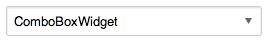
I was under the impression that a select element could be styled in the same way as an input element using 'mw-ui-input' [1] as essentially they are one field.
This came up when I tried to enable MediaWiki UI on select elements in all forms.
If you are curious what this would look like it would look like this: http://tools.wmflabs.org/styleguide/desktop/select.html
Is my impression true? If yes, we should update the documentation to explicitly say that. If no, we should update the documentation and describe how they should be styled...
[1] http://tools.wmflabs.org/styleguide/desktop/section-1.html
Last time I tried this—and its been a while—select elements can't be styled consistently across browsers. The only way to do that would be to write some kind of a (OOUI) JS component.
—prtksxna
This is why I advised people to stop using mw-ui-input/mw-ui-button on elements like this. It isn't consistent and can actually be quite inaccessible on some browser/OS combinations.
--Shahyar
On Mon, Aug 18, 2014 at 12:56 PM, Prateek Saxena psaxena@wikimedia.org wrote:
Last time I tried this—and its been a while—select elements can't be styled consistently across browsers. The only way to do that would be to write some kind of a (OOUI) JS component.
—prtksxna
Design mailing list Design@lists.wikimedia.org https://lists.wikimedia.org/mailman/listinfo/design
Today, I am starting work on the Agora theme for OOUI. So, you could use one of those widgets to solve this problem very soon without having to mix themes.
- Trevor
On Mon, Aug 18, 2014 at 10:13 AM, Shahyar Ghobadpour < sghobadpour@wikimedia.org> wrote:
This is why I advised people to stop using mw-ui-input/mw-ui-button on elements like this. It isn't consistent and can actually be quite inaccessible on some browser/OS combinations.
--Shahyar
On Mon, Aug 18, 2014 at 12:56 PM, Prateek Saxena psaxena@wikimedia.org wrote:
Last time I tried this—and its been a while—select elements can't be styled consistently across browsers. The only way to do that would be to write some kind of a (OOUI) JS component.
—prtksxna
Design mailing list Design@lists.wikimedia.org https://lists.wikimedia.org/mailman/listinfo/design
Design mailing list Design@lists.wikimedia.org https://lists.wikimedia.org/mailman/listinfo/design
So... I still lack an answer to my original question. I understand styling select elements involves care, but I'm asking whether they /should/ be styled like mw-ui-inputs or in a completely different way that needs to be implemented.
On Mon, Aug 18, 2014 at 10:17 AM, Trevor Parscal tparscal@wikimedia.org wrote:
Today, I am starting work on the Agora theme for OOUI. So, you could use one of those widgets to solve this problem very soon without having to mix themes.
- Trevor
On Mon, Aug 18, 2014 at 10:13 AM, Shahyar Ghobadpour sghobadpour@wikimedia.org wrote:
This is why I advised people to stop using mw-ui-input/mw-ui-button on elements like this. It isn't consistent and can actually be quite inaccessible on some browser/OS combinations.
--Shahyar
On Mon, Aug 18, 2014 at 12:56 PM, Prateek Saxena psaxena@wikimedia.org wrote:
Last time I tried this—and its been a while—select elements can't be styled consistently across browsers. The only way to do that would be to write some kind of a (OOUI) JS component.
—prtksxna
Design mailing list Design@lists.wikimedia.org https://lists.wikimedia.org/mailman/listinfo/design
Design mailing list Design@lists.wikimedia.org https://lists.wikimedia.org/mailman/listinfo/design
Design mailing list Design@lists.wikimedia.org https://lists.wikimedia.org/mailman/listinfo/design
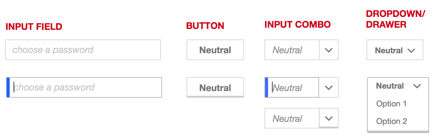
I think they should look different, and decades of operating system UI design would agree. A key here is that a combo box should not look like a drop-down, it should look like an input with a special affordance for showing preset values.
In the OOjs UI Apex theme, selects are outlined only:
[image: Inline image 3]
While inputs (and combo boxes) have a gentle inner shadow:
[image: Inline image 1] [image: Inline image 2]
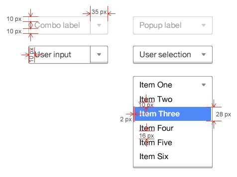
These designs may be old, and I wasn't able to remove the red marks because whoever made the PDF baked them right into the raster graphics for the controls, but this is presumably how combo boxes and dropdowns are meant to be rendered in MediaWiki[1]:
[image: Inline image 4]
I think that at-a-glance the controls look very input-like, and that's a potential problem.
Perhaps May could share a more recent version of this design?
- Trevor
[1] https://www.mediawiki.org/w/index.php?title=File:Agora_specs.pdf&page=9
On Mon, Aug 25, 2014 at 10:55 AM, Jon Robson jdlrobson@gmail.com wrote:
So... I still lack an answer to my original question. I understand styling select elements involves care, but I'm asking whether they /should/ be styled like mw-ui-inputs or in a completely different way that needs to be implemented.
On Mon, Aug 18, 2014 at 10:17 AM, Trevor Parscal tparscal@wikimedia.org wrote:
Today, I am starting work on the Agora theme for OOUI. So, you could use
one
of those widgets to solve this problem very soon without having to mix themes.
- Trevor
On Mon, Aug 18, 2014 at 10:13 AM, Shahyar Ghobadpour sghobadpour@wikimedia.org wrote:
This is why I advised people to stop using mw-ui-input/mw-ui-button on elements like this. It isn't consistent and can actually be quite inaccessible on some browser/OS combinations.
--Shahyar
On Mon, Aug 18, 2014 at 12:56 PM, Prateek Saxena <psaxena@wikimedia.org
wrote:
Last time I tried this—and its been a while—select elements can't be styled consistently across browsers. The only way to do that would be to write some kind of a (OOUI) JS component.
—prtksxna
Design mailing list Design@lists.wikimedia.org https://lists.wikimedia.org/mailman/listinfo/design
Design mailing list Design@lists.wikimedia.org https://lists.wikimedia.org/mailman/listinfo/design
Design mailing list Design@lists.wikimedia.org https://lists.wikimedia.org/mailman/listinfo/design
-- Jon Robson
Design mailing list Design@lists.wikimedia.org https://lists.wikimedia.org/mailman/listinfo/design
Currently our buttons look like this http://tools.wmflabs.org/styleguide/desktop/section-2.html
[image: Inline image 1] And on compact personal bar, the select looks like this https://www.dropbox.com/s/e7o7ywyhkdggx0h/Screenshot%202014-08-25%2011.58.39.png?dl=0
[image: Inline image 2]
and if you look above your gmail search bar input combo box, it looks like this https://www.dropbox.com/s/gt9twpqrixhninu/Screenshot%202014-08-25%2012.19.39.png?dl=0. Very similar to ours.
[image: Inline image 4]
I don't believe we've had complications with users with these styles so far. To set the right expectations for it to be an input field or a select button/menu, it's more than just how the bounding box looks like or limited to that. A drop down caret is important to show that there is some kind of menu happening. A high contrast text within the bounding box is also important to show that this is not an input field. A light italicized placeholder within a bounding box shows that "this is where you should be typing in your response." Even the label is important.
I don't think the gmail's search bar is the best execution for a input combo box, but I guess it worked. I would've included more affordance to show that it's an input field, but at the same time, the length of the box and the search button next to it kinda gave it away.
So in conclusion, in the effort of being as simple as possible—elements being used for a reason and nothing more with a goal of being consistent as well—I have a strong feeling that this set is going to work! We want to be able to explain what every single element* does effectively without more elements*.
[image: Inline image 6]
*elements being text, icons, color, line, border, etc.
mm
On Mon, Aug 25, 2014 at 11:26 AM, Trevor Parscal tparscal@wikimedia.org wrote:
I think they should look different, and decades of operating system UI design would agree. A key here is that a combo box should not look like a drop-down, it should look like an input with a special affordance for showing preset values.
In the OOjs UI Apex theme, selects are outlined only:
[image: Inline image 3]
While inputs (and combo boxes) have a gentle inner shadow:
[image: Inline image 1] [image: Inline image 2]
These designs may be old, and I wasn't able to remove the red marks because whoever made the PDF baked them right into the raster graphics for the controls, but this is presumably how combo boxes and dropdowns are meant to be rendered in MediaWiki[1]:
[image: Inline image 4]
I think that at-a-glance the controls look very input-like, and that's a potential problem.
Perhaps May could share a more recent version of this design?
- Trevor
[1] https://www.mediawiki.org/w/index.php?title=File:Agora_specs.pdf&page=9
On Mon, Aug 25, 2014 at 10:55 AM, Jon Robson jdlrobson@gmail.com wrote:
So... I still lack an answer to my original question. I understand styling select elements involves care, but I'm asking whether they /should/ be styled like mw-ui-inputs or in a completely different way that needs to be implemented.
On Mon, Aug 18, 2014 at 10:17 AM, Trevor Parscal tparscal@wikimedia.org wrote:
Today, I am starting work on the Agora theme for OOUI. So, you could
use one
of those widgets to solve this problem very soon without having to mix themes.
- Trevor
On Mon, Aug 18, 2014 at 10:13 AM, Shahyar Ghobadpour sghobadpour@wikimedia.org wrote:
This is why I advised people to stop using mw-ui-input/mw-ui-button on elements like this. It isn't consistent and can actually be quite inaccessible on some browser/OS combinations.
--Shahyar
On Mon, Aug 18, 2014 at 12:56 PM, Prateek Saxena <
psaxena@wikimedia.org>
wrote:
Last time I tried this—and its been a while—select elements can't be styled consistently across browsers. The only way to do that would be to write some kind of a (OOUI) JS component.
—prtksxna
Design mailing list Design@lists.wikimedia.org https://lists.wikimedia.org/mailman/listinfo/design
Design mailing list Design@lists.wikimedia.org https://lists.wikimedia.org/mailman/listinfo/design
Design mailing list Design@lists.wikimedia.org https://lists.wikimedia.org/mailman/listinfo/design
-- Jon Robson
Design mailing list Design@lists.wikimedia.org https://lists.wikimedia.org/mailman/listinfo/design
Design mailing list Design@lists.wikimedia.org https://lists.wikimedia.org/mailman/listinfo/design
On 25/08/14 19:32, May Tee-Galloway wrote:
Currently our buttons look like this http://tools.wmflabs.org/styleguide/desktop/section-2.html
Inline image 1
Is that a disabled button or a regular one?
And on compact personal bar, the select looks like this https://www.dropbox.com/s/e7o7ywyhkdggx0h/Screenshot%202014-08-25%2011.58.39.png?dl=0
Inline image 2
and if you look above your gmail search bar input combo box, it looks like this https://www.dropbox.com/s/gt9twpqrixhninu/Screenshot%202014-08-25%2012.19.39.png?dl=0. Very similar to ours.
Inline image 4
Wow, I never noticed the google one was anything more than a normal input at all (the triangle looks like a smudge on the monitor). The contrast on the personal bar is much better, so well done.
-I
For more clarity, I labelled each control and am showing how each hover state looks like.
[image: Inline image 1]
mm
On Mon, Aug 25, 2014 at 12:49 PM, Isarra Yos zhorishna@gmail.com wrote:
On 25/08/14 19:32, May Tee-Galloway wrote:
Currently our buttons look like this http://tools.wmflabs.org/styleguide/desktop/section-2.html
[image: Inline image 1]
Is that a disabled button or a regular one?
And on compact personal bar, the select looks like this https://www.dropbox.com/s/e7o7ywyhkdggx0h/Screenshot%202014-08-25%2011.58.39.png?dl=0
[image: Inline image 2]
and if you look above your gmail search bar input combo box, it looks like this https://www.dropbox.com/s/gt9twpqrixhninu/Screenshot%202014-08-25%2012.19.39.png?dl=0. Very similar to ours.
[image: Inline image 4]
Wow, I never noticed the google one was anything more than a normal input at all (the triangle looks like a smudge on the monitor). The contrast on the personal bar is much better, so well done.
-I
Design mailing list Design@lists.wikimedia.org https://lists.wikimedia.org/mailman/listinfo/design
On 08/18/2014 12:51 PM, Jon Robson wrote:
I was under the impression that a select element could be styled in the same way as an input element using 'mw-ui-input' [1] as essentially they are one field.
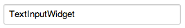
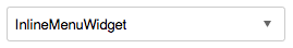
I consider "text input" and "dropdown input" two separate control types.
If you are curious what this would look like it would look like this: http://tools.wmflabs.org/styleguide/desktop/select.html
Technical details aside, I see a few issues. In Firefox, there are two focus indicators (blue bar and dotted line focus indicator). Only one is needed. The left-hand blue bar makes more sense to me for a text input (I can type) since I mentally associate it with a caret.
It might be that we should wait for OOJS-UI for this, especially because people want things like comboboxes (let alone regular styling). HTML5 kind of has this (combobox) apparently with <input type="text" list="something">, but we'd have to do a JavaScript polyfill anyway for real support.
Matt Flaschen
Matthew Flaschen wrote:
Jon Robson wrote:
If you are curious what this would look like it would look like this: http://tools.wmflabs.org/styleguide/desktop/select.html
Technical details aside, I see a few issues. In Firefox, there are two focus indicators (blue bar and dotted line focus indicator). Only one is needed. The left-hand blue bar makes more sense to me for a text input (I can type) since I mentally associate it with a caret.
Yeah same here. And why is it grey background? I used to have white background of select boxes everywhere.
Matthew Flaschen wrote:
It might be that we should wait for OOJS-UI for this, especially because people want things like comboboxes (let alone regular styling). HTML5 kind of has this (combobox) apparently with <input type="text" list="something">, but we'd have to do a JavaScript polyfill anyway for real support.
Matt Flaschen
Thought this /is/ oojs-ui. What is the thing linked above, then?
svetlana
On 26/08/14 12:13, svetlana wrote:
Matthew Flaschen wrote:
Jon Robson wrote:
If you are curious what this would look like it would look like this: http://tools.wmflabs.org/styleguide/desktop/select.html
Technical details aside, I see a few issues. In Firefox, there are two focus indicators (blue bar and dotted line focus indicator). Only one is needed. The left-hand blue bar makes more sense to me for a text input (I can type) since I mentally associate it with a caret.
Yeah same here. And why is it grey background? I used to have white background of select boxes everywhere.
Grey background is normally used on form elements to indicate disabled status, but I think in this case it's either just an old implementation or an issue with the select ement itself, since selects are notoriously difficult to style. Generally you need a pile of js specifically for them if you want anything consistent across browsers, and that may have been missing here.
Anyway, May included some mockups and they all use white, so that looks good. My main concern at this point is how well this (or rather, the framework for this) will translate to other skins, but that's a different discussion entirely.
-I
Isarra, we're designing a single look and feel for controls, community developers are welcome to extend that set to other skins, since the skin of these controls will extensively use LESS (right developers?) this should be a trivial task, and while we're happy to give feedback on these community changes for other skins, we do not have the time or resources to maintain skin specific variations.
*Jared Zimmerman * \ Director of User Experience \ Wikimedia Foundation
M +1 415 609 4043 \ @jaredzimmerman http://loo.ms/g0
On Tue, Aug 26, 2014 at 10:31 PM, Isarra Yos zhorishna@gmail.com wrote:
On 26/08/14 12:13, svetlana wrote:
Matthew Flaschen wrote:
Jon Robson wrote:
If you are curious what this would look like it would look like this: http://tools.wmflabs.org/styleguide/desktop/select.html
Technical details aside, I see a few issues. In Firefox, there are two focus indicators (blue bar and dotted line focus indicator). Only one is needed. The left-hand blue bar makes more sense to me for a text input (I can type) since I mentally associate it with a caret.
Yeah same here. And why is it grey background? I used to have white background of select boxes everywhere.
Grey background is normally used on form elements to indicate disabled status, but I think in this case it's either just an old implementation or an issue with the select ement itself, since selects are notoriously difficult to style. Generally you need a pile of js specifically for them if you want anything consistent across browsers, and that may have been missing here.
Anyway, May included some mockups and they all use white, so that looks good. My main concern at this point is how well this (or rather, the framework for this) will translate to other skins, but that's a different discussion entirely.
-I
Design mailing list Design@lists.wikimedia.org https://lists.wikimedia.org/mailman/listinfo/design
On 27/08/14 06:39, Jared Zimmerman wrote:
Isarra, we're designing a single look and feel for controls, community developers are welcome to extend that set to other skins, since the skin of these controls will extensively use LESS (right developers?) this should be a trivial task, and while we're happy to give feedback on these community changes for other skins, we do not have the time or resources to maintain skin specific variations.
This is a design intended for specific Wikimedia-centric skins, which shouldn't have any bearing on the other skins at that level. My concern there is about the framework - because selects and some other form elements can be so resistent to styling, such a framework will be needed for any skin that tackles these things. If the framework being created for this will be generic enough for any skin to use, that would be very useful to many projects, so it's something for the developers to consider.
-I