Images are all manner of aspect ratios and thus they will not line up
like you make out in the mockups unless you arbitrarily crop them or do
something funky with them, and making them smaller limits the funky
things that can reasonably be done.
On 20/02/2013 08:37, Shankar Narayan wrote:
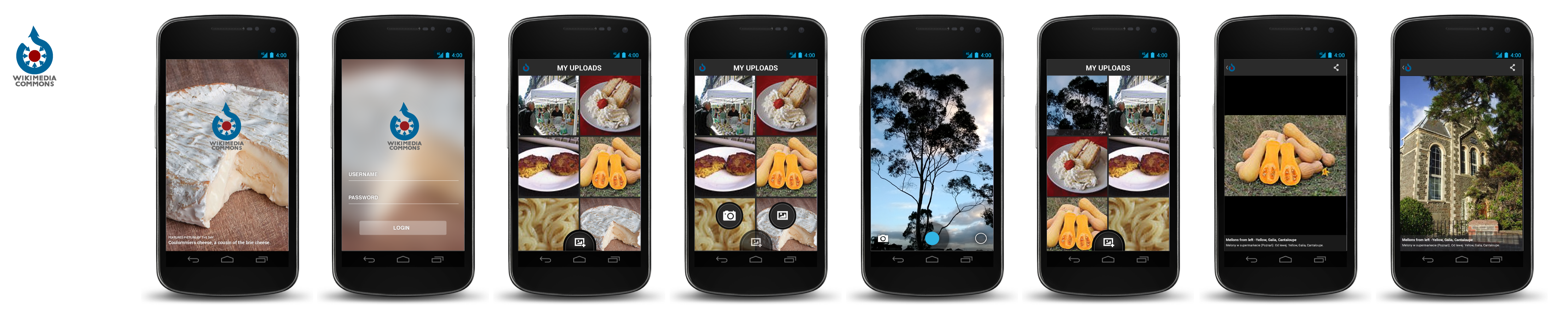
Heres a mockup[1] of both the views that are being
discussed. This
should help us decide which one to pick :). This decision is critical
as we may want to use the same view across the app to maintain
consistency.
Smaller thumbnails take less real estate, and gives one a sense of
there being a *lot* of images. Also, its easier to swipe through many
images in one go. As the thumbnails are smaller, having text overlays
would take away a lot of focus from the image.
[1]
http://upload.wikimedia.org/wikipedia/commons/5/5d/Commons_gallery_view_opt…
On 20 February 2013 00:15, Brion Vibber <bvibber(a)wikimedia.org
<mailto:bvibber@wikimedia.org>> wrote:
On Fri, Feb 15, 2013 at 10:59 PM, Shankar Narayan
<notnarayan(a)gmail.com <mailto:notnarayan@gmail.com>> wrote:
Hello Everyone,
for the past week I have been iterating on the commons android
visual design. Wanted to share the current iteration for
feedback/comments/suggestions.
https://upload.wikimedia.org/wikipedia/commons/c/c6/Commons_media_discovery…
Just an update - me and Yuvi have been trying to figure out the
best size to display thumbnails in the "my uploads" and similar views.
At the moment the mockups and the iOS implementation show two
items across on a phone-sized screen, for about ~6 items on screen
at once. File title isn't shown until you tap into a detail screen.
The Android implementation currently uses more ample thumbnails
which take the full device width, and reserved some space to show
the title. This only shows ~2-3 items on screen at a time on a
phone, but the pictures look _awesome_ and you may be able to more
easily distinguish adjacent similar issues due to seeing the title.
(I've also proposed the idea of a selectable zoom control (either
pinch-zoom or a slider), but this gets complicated and probably
isn't the way to go.)
For comparison, the iOS "Photos" app shows 4 items across, and the
Android "Gallery" app shows 3 items across. Neither shows titles
or filenames, and neither has controllable zoom on the overview.
Do we want to go even smaller like the photo gallery apps to
squeeze more items in? Or stay large to show the title on the main
screen? Or go with a middle-ground that shows off images well but
doesn't have room for titles?
-- brion
_______________________________________________
Design mailing list
Design(a)lists.wikimedia.org <mailto:Design@lists.wikimedia.org>
https://lists.wikimedia.org/mailman/listinfo/design
_______________________________________________
Design mailing list
Design(a)lists.wikimedia.org
https://lists.wikimedia.org/mailman/listinfo/design 