That's more like it ;)
Also, I'd squeeze in a few most recent notifications in there when we
have Echo.
On 04/25/2013 12:11 PM, Maryana Pinchuk wrote:
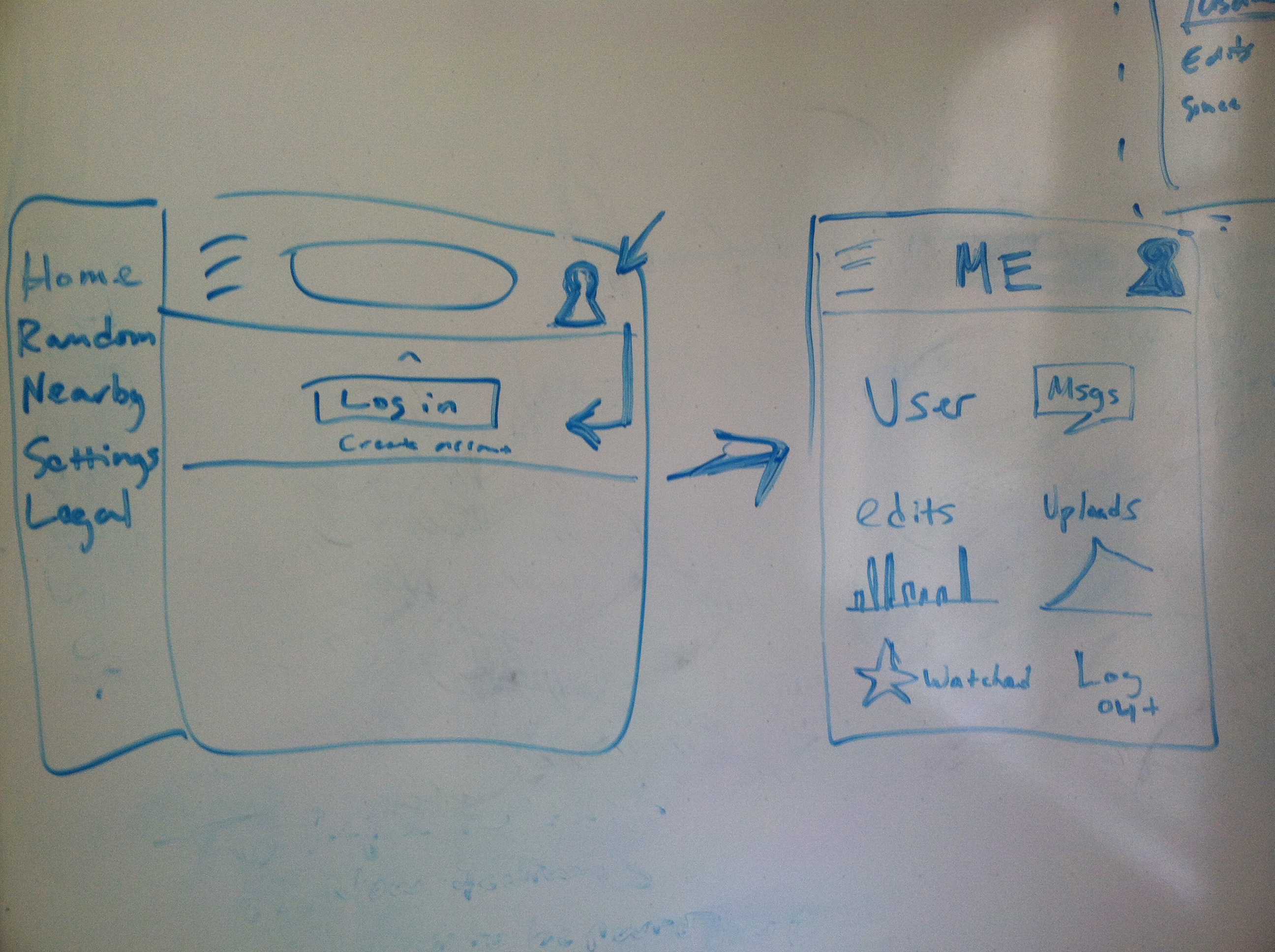
You're right, Vibha; a picture is worth a thousand
words :)
Jon, ignoring the specific elements of what's in the "me" menu (all
just placeholders at this point), does my scribbling below make more
sense conceptually? Despite the "nav" in the title, the story card
actually leaves implementation pretty open:
https://mingle.corp.wikimedia.org/projects/mobile/cards/579. I can
clarify in the title of the card and the A.C. that this should be an
overlay, not a nav. Does that address some of your concerns?
Inline image 1
On Thu, Apr 25, 2013 at 11:32 AM, Vibha Bamba <vbamba(a)wikimedia.org
<mailto:vbamba@wikimedia.org>> wrote:
At this point we should be doing this at a whiteboard.
There are some legitimate concerns but text is hardly a medium to
improve ideas =]
On Thu, Apr 25, 2013 at 11:21 AM, Maryana Pinchuk
<mpinchuk(a)wikimedia.org <mailto:mpinchuk@wikimedia.org>> wrote:
On Thu, Apr 25, 2013 at 10:39 AM, Jon Robson
<jrobson(a)wikimedia.org <mailto:jrobson@wikimedia.org>> wrote:
I'm beginning to exhibit raging hatred of the right nav
concept...
Firstly.. Ergg. two settings is confusing (site and user)
- they
should be the same page and there is no reason why they
can't be. It
would be great if when logged in the settings page morphed
from device
specific to user specific. Would be great to be able to
activate alpha
on all my devices.
In terms of a right nav, the more I think about it and
having played
with a prototype I knocked up, the more I think a right
nav is bad.
Although it seems to be becoming an established pattern it
seems like
an easy option that in my opinion is badly implemented. We
can do
better and should lead by example. For one I never touch
the Facebook
one... it just doesn't come natural. I also don't like the
idea of 2
menus. I wonder if we could envision 2 stacked menus that
can be
toggled between and persist when selected.
To quote
http://www.upassoc.org/upa_publications/jus/2011august/faulkner2.html
"... Kingsburg and Andre carried out two studies with 16
users and
found in both of their studies that selection from a
left-hand menu
was faster than from a right-hand menu (2004). However,
their research
also showed that selections were best done from the same
panel,
whether that was on the right or left. Thus it is better
to have a
single design, either on the left or the right, rather
than a mixed
navigational method that requires the user to select from
both left
and right panels (Kingsburg & Andre, 2004). This is hardly
surprising
and is both predicted and supported by Fitts’ Law. (1954)."
The thing that bugs me most is that when you move your
finger over the
left hamburger button and press it the page moves to the
left. Your
finger is still above the button. This doesn't apply to
the right
menu. Your finger is now above something else. This to me
is very
jarry and always feels icky.
It still leaves the question of where things such as watch
star, talk
page link, edit, move and delete buttons go.
The bottom would make sense for an app, but position fixed
is buggy in
the majority of current mobile browsers and we will need a
fallback of
some sort.
Is it just the "nav" part that bothers you, and not so much
the "right" and "my stuff" part? What if we had a little
person icon to the right of the search bar, and tapping that
opened an overlay with pretty visualizations of your recent
editing and uploading activity, as well as links to your
watchlist and talk page? /That's/ what I ultimately want to
work toward; in my mind, the nav part was always just a
stepping stone, but maybe we don't actually need that stepping
stone and can just go directly to (sneakily) beginning work on
a totally new, totally rad mobile userspace :)
--
Maryana Pinchuk
Associate Product Manager, Wikimedia Foundation
wikimediafoundation.org <http://wikimediafoundation.org>
_______________________________________________
Design mailing list
Design(a)lists.wikimedia.org <mailto:Design@lists.wikimedia.org>
https://lists.wikimedia.org/mailman/listinfo/design
_______________________________________________
Design mailing list
Design(a)lists.wikimedia.org <mailto:Design@lists.wikimedia.org>
https://lists.wikimedia.org/mailman/listinfo/design
--
Maryana Pinchuk
Associate Product Manager, Wikimedia Foundation
wikimediafoundation.org <http://wikimediafoundation.org>
_______________________________________________
Design mailing list
Design(a)lists.wikimedia.org
https://lists.wikimedia.org/mailman/listinfo/design 