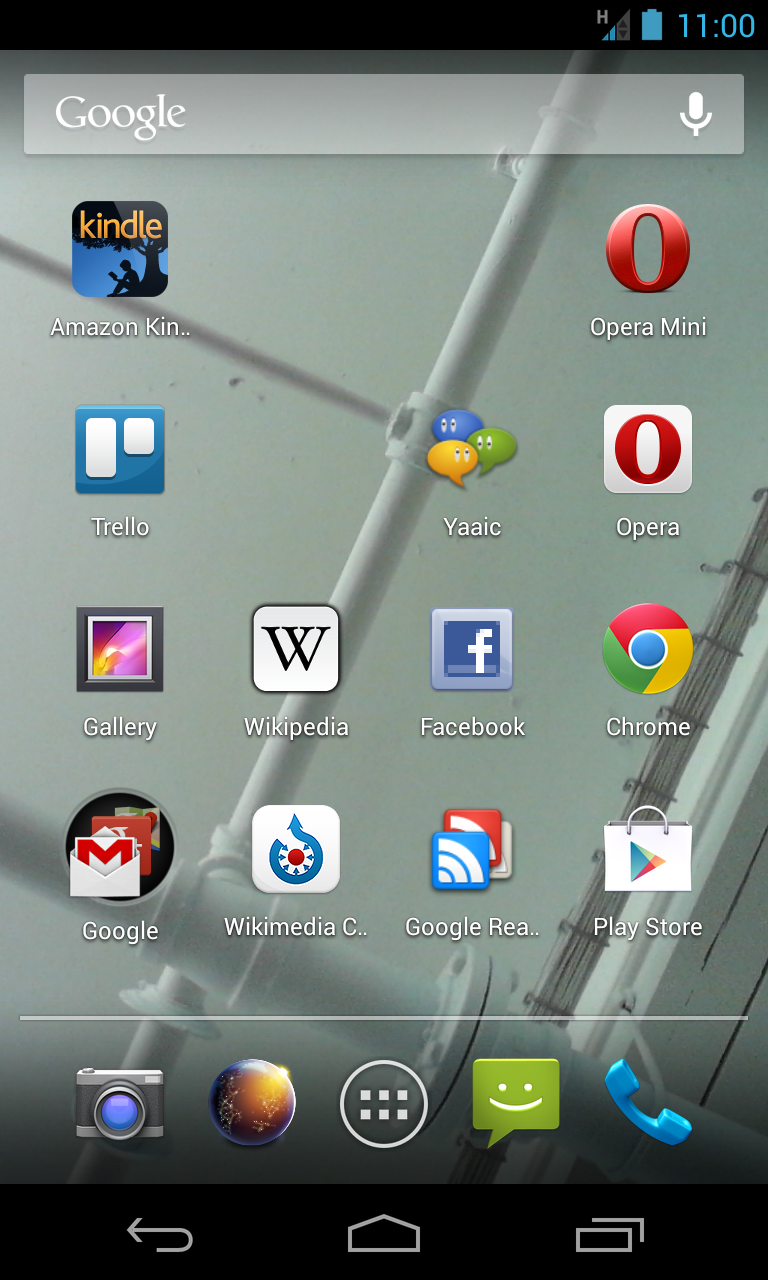
Here's my Android phone's home screen with this version of the icon. (Attached)
-- brion On May 22, 2013 10:57 AM, "Jared Zimmerman" jared.zimmerman@wikimedia.org wrote:
I don't know a ton about android icons, it *looks* fine, but I'm unaware if the OS adds crop and gloss, you're team would probably be the best to know that, is is possible to show me what the icon looks like on the device before pushing it to the app store?
*Jared Zimmerman * \ Director of User Experience \ Wikimedia Foundation M : +1 415 609 4043 | : @JaredZimmermanhttps://twitter.com/JaredZimmerman
On Wed, May 22, 2013 at 10:51 AM, Tomasz Finc tfinc@wikimedia.org wrote:
Jared, any issue with us using these?
On Tue, May 21, 2013 at 2:25 PM, Brion Vibber bvibber@wikimedia.org wrote:
I'm removing the 'beta' branding from the Android version of the
Commons app
for our next release.
This provisional commit replaces the current beta icons with the icons I found in the WMF design DropBox, and also tosses in a copy of the PSD
source
file (compressed as it's huge) under a 'scratch' directory so we don't
lose
it:
https://github.com/brion/android-commons/commit/811a23c17fa9a0cb52171c17561c...
Design folks who worked on the icons, please confirm if this is the
correct
icon set -- it's a little different from the beta icon, and I don't know whether that's deliberate or not. :) If there are newer assets for this please let me know and I'll merge them instead!
Thanks!
-- brion
Design mailing list Design@lists.wikimedia.org https://lists.wikimedia.org/mailman/listinfo/design
Design mailing list Design@lists.wikimedia.org https://lists.wikimedia.org/mailman/listinfo/design