We did another round of guerrilla testing for VE on mobile today. Overall
it was much improved from the last tests!
Especially these changes: X icon to back icon, arrow icon to word "next",
save page updates, and the switch between edit modes.
Here are those findings:
- Used back button and it did what they expected
- Hesitated when asked to save but all were able to find "Next" button
- Filled out the save screen appropriately, although 1 person said it
looked like an error screen at first
- When asked to switch to wikitext, tapped gear icon almost immediately,
but several people still struggled with "edit" and "edit source"
language.
Everyone also struggled with the pop-up asking them to save before
switching.
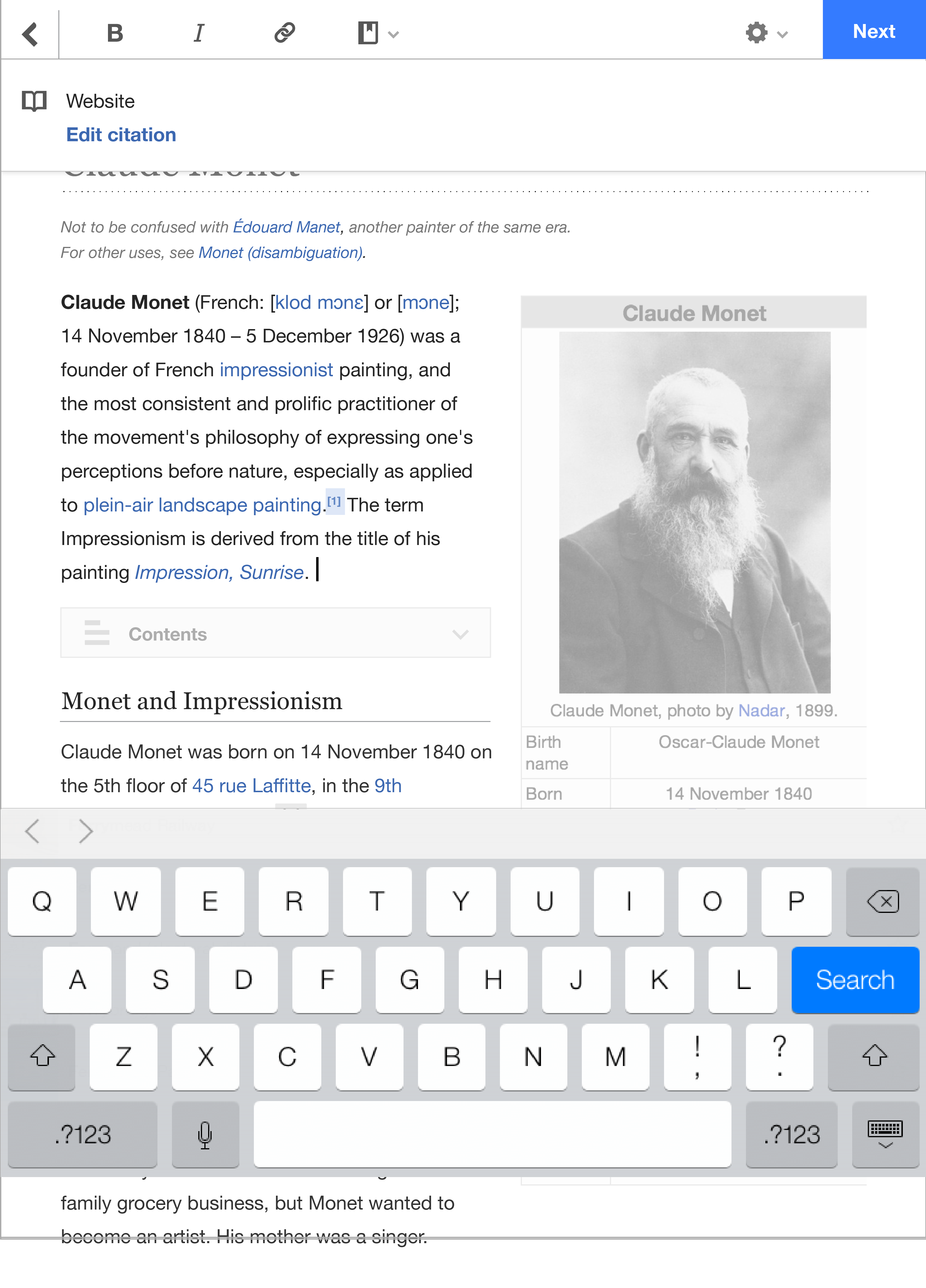
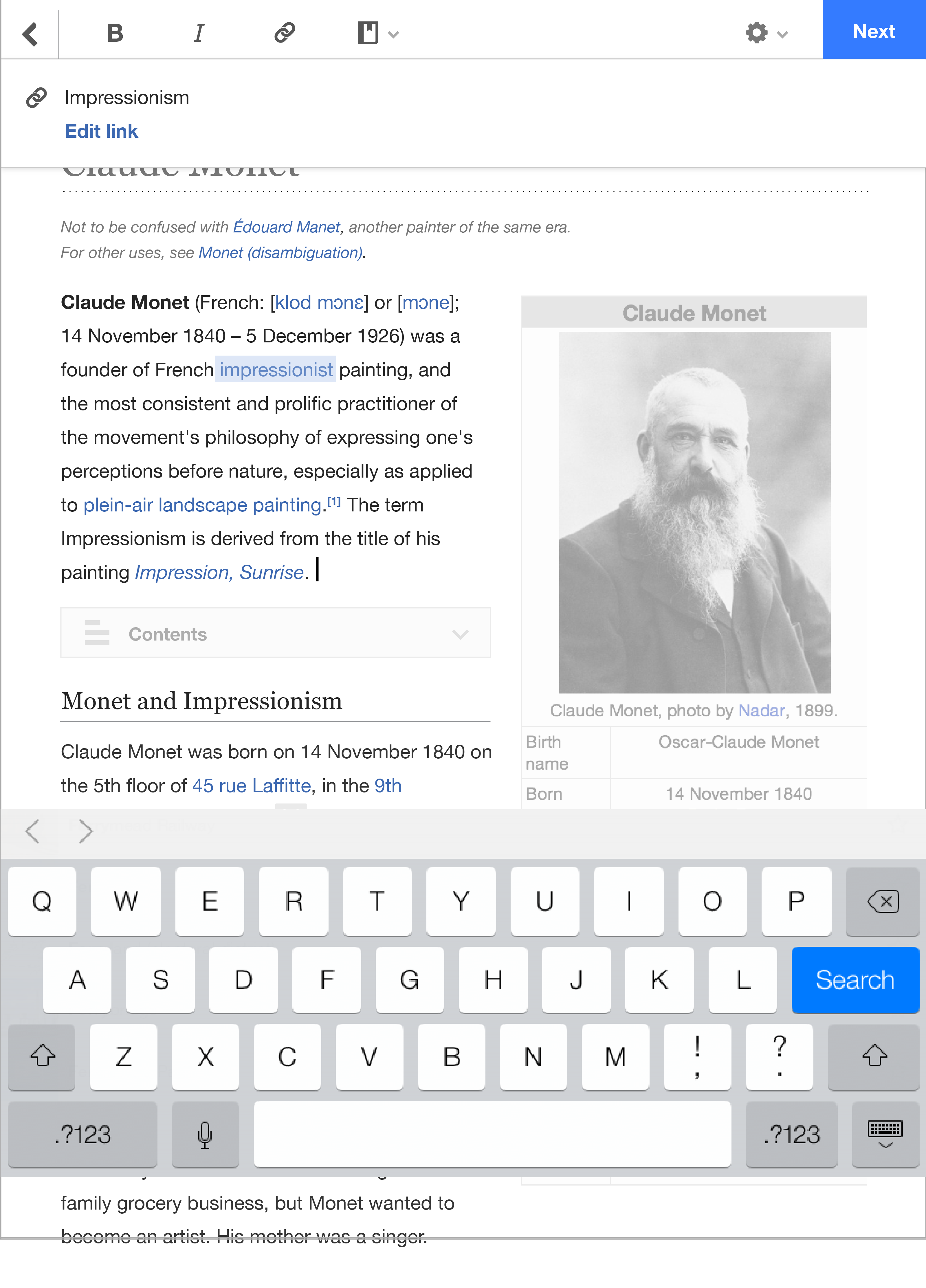
But the link and reference context bars really failed the user tests.
:( Most did not notice that the icon in the toolbar was highlighted. Nobody
even noticed the context bars, and didn't know what they meant when I
pointed to them.
More notes
https://www.mediawiki.org/wiki/Design/Research/VE_on_mobile#July_30.2C_2014…
I would suggest we try adding blue links that say "edit link" and "edit
citation" in those context bars, to show a user what they'll be doing
specifically. The taller height will also make the bar more noticeable.
Then we can test again!
Thanks,
Kaity