Hey lets check in on this - with VE in stable I think the context problems
need to be addressed.
The findings were that most users tested did not notice that the icon in
the toolbar was highlighted. Nobody even noticed the context bars, and
didn't know what they meant when I pointed to them.
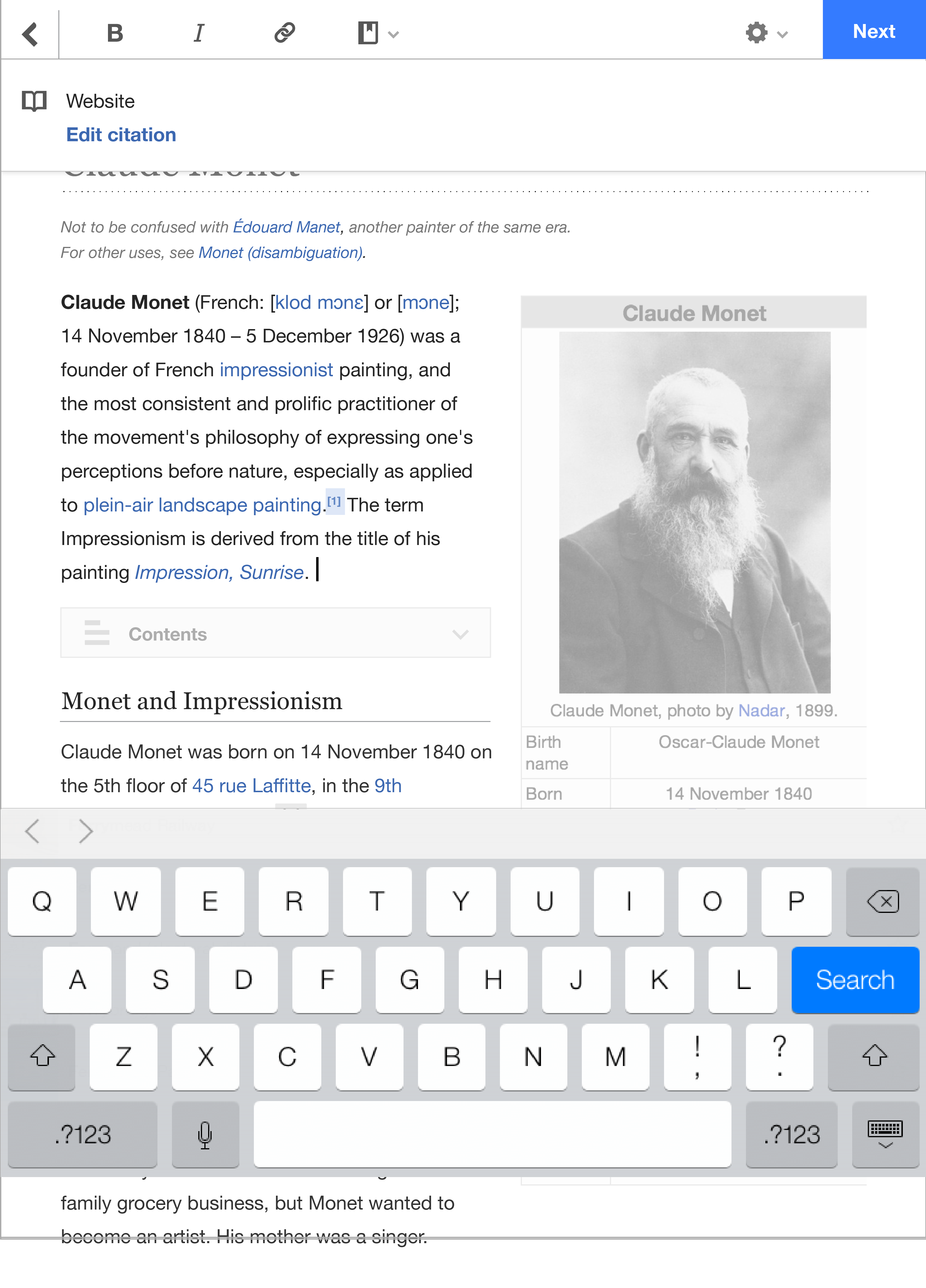
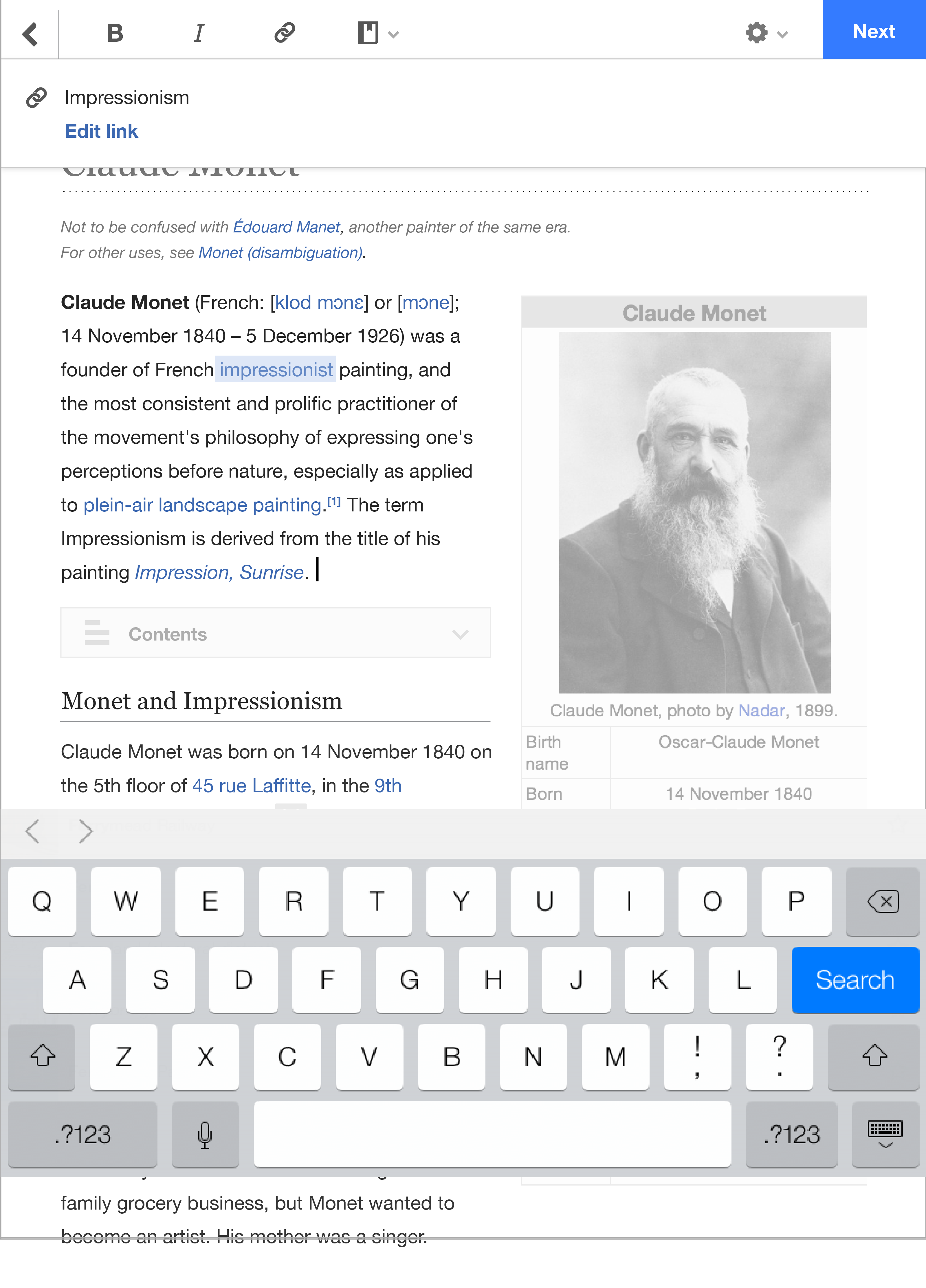
My suggestion is to add blue links that say "edit link" and "edit
citation"
in the context toolbars and give them more height. We can do this easily
and then quickly test with users.
Maryana I agree we need to keep thinking about this and maybe do something
completely different but I think this is a good first step.
On Thu, Jul 31, 2014 at 9:19 PM, Juliusz Gonera <jgonera(a)wikimedia.org>
wrote:
I think we should try Kaity's suggestion of adding
a prominent "edit"
button in the context and see what happens. It's a much easier change
than reengineering the whole context again. We had a reason to give up
on tooltips on tablets and that reason is still present (native
copy/paste tooltips).
On Thu, Jul 31, 2014 at 11:49 AM, Maryana Pinchuk
<mpinchuk(a)wikimedia.org> wrote:
Thanks, Kaity!
I'm not that surprised by the context stuff. There's a lot going on in
that
top toolbar, and on a big tablet screen, that
area is likely to be quite
far
away from (and thus totally contextually detached
from) the
link/reference
the user has just tapped.
I'm not convinced, though, that simply adding a more prominent call to
action in the toolbar and/or highlighting the target will be enough to
overcome the usability hurdle; to me, this requires a rethink of the
location/shape of the dialog, testing a version that's a floating tooltip
like on desktop, etc. I'm CC-ing James because we should work out whose
purvey this now falls under. We're still kinda muddling our way through
our
collaboration ;) but now that tablet VE has gone
into stable, we should
start thinking more intentionally about the ownership and prioritization
of
things like this. Specifically:
* Who owns the product specification, design, and engineering work of
iterations on existing mobile VE features and new features?
* Who prioritizes this work against the bigger backlog of VE features and
bugs?
It seems to me that one product owner and one team should be responsible
for
both of these points – otherwise we might get
into a weird situation
where
one team spends a lot of time designing something
and then it doesn't go
live because it gets deprioritized by the other team, or where new VE
features are designed with one specific platform in mind and the other
platform has to play catchup to work right.
James, going forward, I see work like this (e.g., refining and testing
the
mobile tablet context menu workflow) as an
Editing team thing – does that
sound right to you?
Of course, realistically, the Mobile Web team still has a lot of the
domain
expertise in mobile devices/browsers and will
need to continue helping to
iron out any mobile-specific issues, review and test stuff, etc. But as
far
as who makes the call on whether to iterate on
this design versus build
some
new feature on VE, and who does the majority of
the architectural
legwork to
make that happen, the ball seems to be more in
the Editing team's court
at
this point. James (and anybody else who's
been involved in the MFE-VE
collaboration, of course), lemme know what your thinking is on all this.
On Wed, Jul 30, 2014 at 6:16 PM, Kaity Hammerstein
<khammerstein(a)wikimedia.org> wrote:
>
> We did another round of guerrilla testing for VE on mobile today.
Overall
> it was much improved from the last tests!
> Especially these changes: X icon to back icon, arrow icon to word
"next",
> save page updates, and the switch between
edit modes.
>
> Here are those findings:
>
> Used back button and it did what they expected
> Hesitated when asked to save but all were able to find "Next" button
> Filled out the save screen appropriately, although 1 person said it
looked
> like an error screen at first
> When asked to switch to wikitext, tapped gear icon almost immediately,
but
> several people still struggled with
"edit" and "edit source" language.
> Everyone also struggled with the pop-up asking them to save before
> switching.
>
> But the link and reference context bars really failed the user tests. :(
> Most did not notice that the icon in the toolbar was highlighted. Nobody
> even noticed the context bars, and didn't know what they meant when I
> pointed to them.
>
> More notes
>
https://www.mediawiki.org/wiki/Design/Research/VE_on_mobile#July_30.2C_2014…
>
> I would suggest we try adding blue links that say "edit link" and
"edit
> citation" in those context bars, to show a user what they'll be doing
> specifically. The taller height will also make the bar more noticeable.
Then
we can
test again!
Thanks,
Kaity
_______________________________________________
Mobile-l mailing list
Mobile-l(a)lists.wikimedia.org
https://lists.wikimedia.org/mailman/listinfo/mobile-l
--
Maryana Pinchuk
Product Manager, Wikimedia Foundation
wikimediafoundation.org
_______________________________________________
Mobile-l mailing list
Mobile-l(a)lists.wikimedia.org
https://lists.wikimedia.org/mailman/listinfo/mobile-l