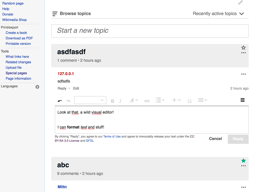
What happens when there's a scroll bar?
The text area will grow as usual as you type. Once it gets to the
max-height, a scrollbar will appear only to the text without including the
toolbar.
In this prototype
<http://pauginer.github.io/prototypes/flow/editor/index.html> the text area
is not growing, but you can experience the scrollbar appearing.
I think it needs a gray divider (like VisualEditor in a page) or background
(like Gmail, the wiki editor toolbar, etc.).
I would start by presenting the controls as part of the editing area. I
think providing controls in that way is common in messaging apps (e.g., to
provide secondary options such as add images) and keeps the maximum focus
to the message. I agree in taking a close look to this aspect to identify
issues that may suggest providing more contrast between the content and the
tools (a separator line or gray-ish background seem both good candidates in
case we need them).
Is the rightmost <> icon the one-way "Switch to source editiing" as in
VE?
Yes. In the prototype
<http://pauginer.github.io/prototypes/flow/editor/index.html> I added some
tooltips considering that we are keeping the preference persistent and the
switch may hapen in longer periods of time.
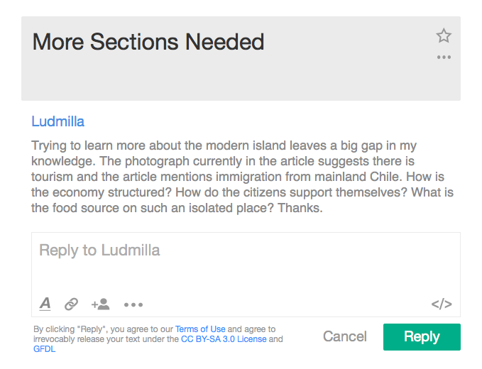
Pau, is the change to heavy gray "Reply to Ludmilla" placeholder text in
your design intentional? The current lighter italic
"Reply to "content of
post"" looks better. What's the rationale for changing the placeholder
text
from the message content to the person to whom you're replying?
That was an inaccuracy on the mockups. Sorry for the confusion.
Thanks for your feedback!
Pau
On Fri, Mar 6, 2015 at 9:52 PM, S Page <spage(a)wikimedia.org> wrote:
> I think icons at the bottom could work better and it's good to encourage
> conversation over presentation, but it's strange that they appear part of
> the text area. What happens when there's a scroll bar? I think it needs a
> gray divider (like VisualEditor in a page) or background (like Gmail, the
> wiki editor toolbar, etc.).
>
> Is the rightmost <> icon the one-way "Switch to source editiing" as
in VE?
>
> Pau, is the change to heavy gray "Reply to Ludmilla" placeholder text in
your design intentional? The current lighter italic
"Reply to "content of
post"" looks better. What's the rationale for changing the placeholder
text
from the message content to the person to whom you're replying?
>
> On Thu, Mar 5, 2015 at 2:43 PM, Danny Horn <dhorn(a)wikimedia.org> wrote:
>
>> Here's the screenshot that Matthias sent of what the default VE toolbar
>> looks like on Flow.
>>
>> I assume that we could hide the components that aren't useful for us, but
>> even then, I think it feels really heavy above the entry field. It's a lot
>> of controls for a small entry field.
>>
>> So -- seeing this confirms for me that we need to use Pau's design (also
>> attached), which puts the controls inside the entry field. If that turns
>> out to be unexpectedly crazy harder than we expect, then this would be a
>> distant second choice for v1, but it would have to be a pretty extreme
>> version of harder.
>>
>> _______________________________________________
>> EE mailing list
>> EE(a)lists.wikimedia.org
>>
https://lists.wikimedia.org/mailman/listinfo/ee
>>
>>
>
>
> --
> =S Page WMF Tech writer
>
> _______________________________________________
> EE mailing list
> EE(a)lists.wikimedia.org
>
https://lists.wikimedia.org/mailman/listinfo/ee
>
>
--
Pau Giner
Senior User Experience Designer
Wikimedia Foundation