I have a built a prototype of the slider. It has a few basic features. I
have not yet added it to the tool but you can
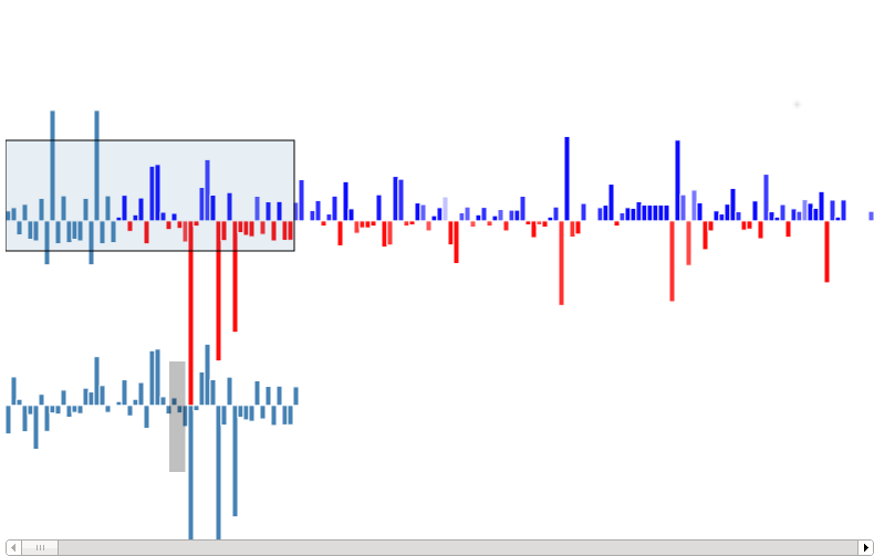
play<http://bl.ocks.org/cosmiclattes/6854429> with
it.
On moving the slider to the left corner more data gets progressively added.
Additions are blue bars in the positive direction and deletions are red
bars downwards.I'm using a power scale to scale down the edit sizes ( The
size of the bar is proportional to the edit size). It works much like the
google finance chart slider.
In the prototype above the selected portion is show below with in the same
proportions (It will be enlarged , have a tooltip on hover showing the
details related to the edit etc & have a handle to select the edit to begin
the animation from).
I tried showing the temporal distance between the edits by coloring the
bars based on the time difference between consecutive edits (The data that
you see in the slider is the edits from the page JSON). This isn't working,
in the prototype a user can hardly make out the time difference between the
edits. Another approach to show the time difference between two edits that
I came across was showing the time difference between each edits with a
separate
scale<http://rossshannon.com/publications/softcopies/Shannon2009Time-seq…
.
I'll be adding the basic slider to the viz tool in the coming week.
Looking forward to ideas and comments.
I'm a complete newbie to design, I haven't yet gotten around to read Tufte
:-). I've been looking at a lot of vizualisation by Ben Fry & Mike Bostock.
I've attached a screen shot of the prototype.
Thanks
Jeph