On Sun, 10 Aug 2014, at 02:59, gnosygnu wrote:
I can't read single-color flat icons. I don't discern them as something clickable
or functional.
In 1990s, Microsoft invented 256 colors icons which look a bit 3d:
http://www.7tutorials.com/files/img/wordpad/Wordpad_1.jpg
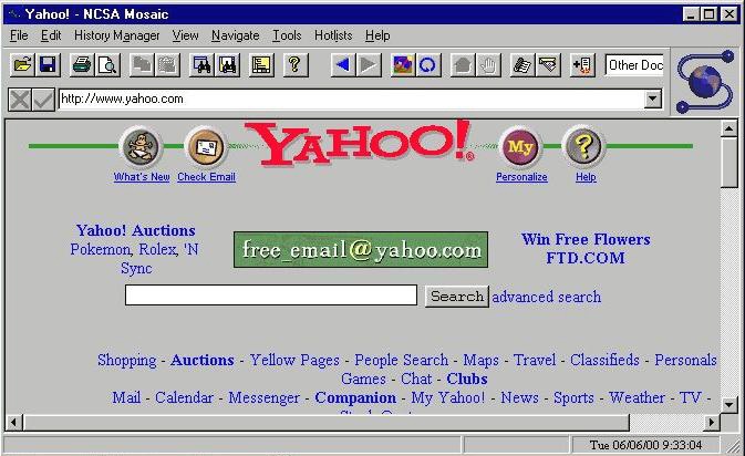
these icons were used by other apps:
http://www.favbrowser.com/images/mosaic-browser.jpg
and today 3d with more color such as notepad in windows 7:
https://3.bp.blogspot.com/-z8qe-WH8cYY/TsSHqCM_tqI/AAAAAAAAASw/cOD0O7Nw00k/…
but in windows 8 the icon is flat and two-color again which is a pain:
http://icons.iconarchive.com/icons/dakirby309/windows-8-metro/256/Apps-Note…
can we please go away from flat one- or two-color icons in web design?
svetlana