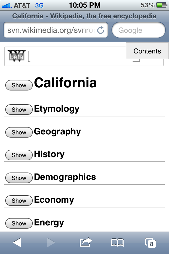
So I'm torn on this. I like the tablet mockup with a table of contents on
the side (though I actually tend to use the normal view on a tablet) but am
a bit skeptical about the phone sized one.
- The small issue: The floating contents button covers up a bit of
content (not much obviously but anything will while scrolling) and has some
oddities while using.
- The bigger issue is fairly easy to fix: There is no way to escape out
of the contents section (like an x or back) other then clicking a section
once it's opened which was confusing when I wanted to drop back to the main
list of condensed sections.
The biggest thing though is more of a gut feeling. It just feels... clunky.
I think that if using the site myself I'd rather use the, already hidden,
sections (pressing show/hide as needed) rather then the contents and save
the extra click each time. Having to click over in the corner to get a
table of contents seems a bit superfluous when the section list (with a
show/hide) essentially acts as the same thing showing what is available.
James
On Sun, Dec 11, 2011 at 11:35 AM, Brion Vibber <bvibber(a)wikimedia.org>wrote;wrote:
Did a quick mockup of a floating/togglable table of
contents for the
mobile view:
http://svn.wikimedia.org/svnroot/mediawiki/trunk/mockups/mobile-sections/in…
* sets up section 0 as a togglable section as well
* on narrow screens, ToC shows fullscreen, triggered by a floating fixed
button in the corner, so it's always available
* on wider screens (such as tablets), ToC shows as a fixed sidebar
This is a fairly primitive quicky mockup and requires position:fixed to
work ('for reals' would need some smarts for some platforms to scroll
things around) and makes no attempt for things to be formatted nicely. ;)
Clicking a section in the toc bar also does a toggle rather than
unconditional _show_, so sometimes hides things instead. ;)
Seems to work in iOS 5 (iPod Touch and iPad) and Android 2.3 (Nexus 1
stock browser), as well as on desktop Firefox.
Any thoughts? I kinda like the notion of having navigation controls always
accessible; perhaps tweak things with a nicer section list and displaying
only one section at a time by default.
(A lot of portal-style pages also interact poorly with our mobile section
collapse/expand right now, so that might need some adjustment as well...)
-- brion
_______________________________________________
Mobile-l mailing list
Mobile-l(a)lists.wikimedia.org
https://lists.wikimedia.org/mailman/listinfo/mobile-l
--
James Alexander
Business Analyst - Fundraising
Wikimedia Foundation