Restarting the Commons Android app icon discussion; we want to ship an
update in the next couple weeks so it'd be great to get this sorted out.
Some quick notes:
* Don't forget to talk to your clients when planning designs! I felt a
little bit like the first version from the design team got created with no
input from the people working on the app, and that my feedback wasn't
welcome because I wasn't in on the design team's original discussion. This
is an open, transparent organization with an open, iterative software
development process, and we expect to be able to participate in all aspects
of that.
* Always test icons in a realistic environment next to other built-in apps
and third-party apps -- if you guys don't have good templates for this, I
can produce more screenshots from my phones and tablets that you can
cut-n-paste into.
* We *always* need a vector original that we can keep in source control so
future revisions or new resolutions can be created as necessary. SVG is
strongly preferred, since it can be edited with free tools, uploaded to the
wikis, viewed in browsers, etc.
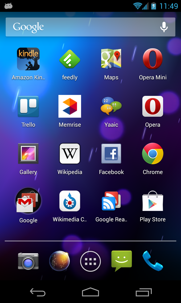
Here's a screenshot of my phone with the current temporary icon in place:
https://upload.wikimedia.org/wikipedia/mediawiki/5/5e/Commons-android-Curre…
^ This current icon is "too iOS-y"; it has a color logo, is very gradienty,
etc. We have a PSD original somewhere in the design Dropbox share but since
it's a PSD we can't edit it with free tools.
Here's a screenshot with the proposed icon May put together based on
discussion from the design team:
https://upload.wikimedia.org/wikipedia/mediawiki/0/0f/Commons-android-Flat-…
^ To me this is overly flat and washed out -- the logo is mid-gray on
white. We have no original vector version that I can find, only the output
versions on dropbox. I'm not willing to ship this icon as-is, but it's a
good starting-off point for discussion.
Here's a screenshot today with an iteration I tossed together:
https://upload.wikimedia.org/wikipedia/mediawiki/d/d2/Commons-android-Flat-…
^ This has a black-on-offwhite icon which I think fits in better with other
Android launcher icons, and tweaks shading to match the 'light source on
top' look (top is lighter than the front, not darker). We have an SVG
original in source control:
Git branch with this icon:
https://github.com/brion/apps-android-commons/commits/mono-icon
SVG and large PNG in scratch dir:
https://github.com/brion/apps-android-commons/tree/mono-icon/scratch/icon-m…
Thoughts?
-- brion