Shahyar,
thanks for noticing the details. Now I've seen the ragged spacing of
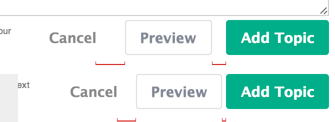
Cancel [ Preview ] [ Reply ] it can't be unseen!
TL;DR :
1. I think having consistent bordered buttons in a form is worthwhile, and
mw-ui-sleeper for the secondary ones is a good solution to avoid the
multi-colored Skittles problem.
2. We should be able to apply the coloring behavior on hover & click of
constructive/destructive/progressive/neutral to any text, including Reply *
Edit * Thank.
3. What about your mw-ui-thin for the button in the topic titlebar ?
Talking about these things is hard because we're imagining what button
states will be and how they'll combine. It would be great if you could
build a new Living Style Guide with many example buttons and text
explaining the CSS usage. Change mediawiki.ui in core, cd resources , type
make kss.
On Tue, Mar 25, 2014 at 3:43 PM, Shahyar Ghobadpour <
sghobadpour(a)wikimedia.org> wrote:
You are essentially forced to override mw-ui-quiet CSS
locally to have no
padding for it to look "normal", and then in that case, they are no longer
button-like, but are instead simple links.
(There is another approach, which is to draw a border around mw-ui-quiet
buttons like Cancel upon hover and click. "Why is this alignment ugly?
Oh,it's a button." I'm not crazy about that solution.)
-
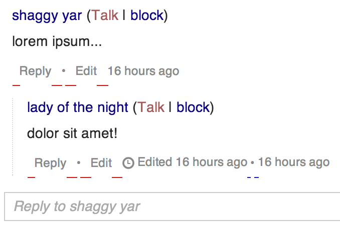
* Solution:* We are now using a bordered-button for all form buttons in
Flow. We shouldn't be trying to hide buttons from the end user.
OK, but then we do hide buttons with Reply * Edit * Thanks . I think the
current
mix of borderless and bordered in Cancel [ Preview ] [Reply] can be
defended, though I prefer your approach.
-
* Solution: *I've since changed [ Reply * Edit * Thanks ] to simple
anchors with no special classes.
Noooo. These should have the constructive/progressive/destructive coloring
that
mw-ui-quiet buttons get on hover and click. Try it at
http://tools.wmflabs.org/styleguide/desktop/section-2.html . Button colors
communicate meaning, they're not just some arbitrary Agora color palette,
we need to use them.
A simple anchor with underline has problems for me because I right-click on
anchors to copy URLs, to open in new tabs and windows, etc.
So I think mw-ui-constructive/progressive/destructive and mw-ui-neutral
should be decoupled from mw-ui-button's border and padding, so that you can
apply them anywhere to get the state highlighting.
In fact, I'm advocating that we remove [mw-ui-quiet] entirely from core,
and instead use a different quiet button that is somewhere between the
current quiet and the current regular buttons. I've been calling them "
mw-ui-sleeper" for now. Here is an example of it in action (on topic
Reply, Preview, and Cancel).
http://area51.yar.gs/wmf/flow1/
(Note: click in a textarea to see the buttons appear, and enter something
to see them activate.) I like it. Your mockup also introduces a
mw-ui-thin [Reply] inside the topic titlebar. When would people use that
instead of your inline Reply button or a full button? Is it a Flow-only
design?
--
=S Page Features engineer